A look at 2018 design trends starts with colour.
Every year, various paint makers announce their upcoming palettes and colours of the year. The biggest of these comes not from a paint maker, but from industry leader The Pantone Color Institute, which influences fashion, textiles, home decor and interior design.
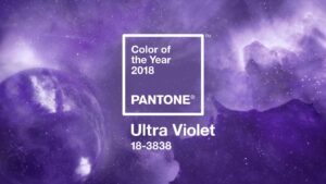
Pantone’s colour for 2018 is called Ultra Violet, a purple shade that “communicates originality, ingenuity, and visionary thinking that points us toward the future,” the company says on its website. “Ultra Violet suggests the mysteries of the cosmos, the intrigue of what lies ahead, and the discoveries beyond where we are now.”
The choice is also in line with a handful of flowers of the year that have been identified and are also shades of purple.
Pantone has also released its spring colour forecast. The forecast is a series of eight palettes on various themes, and these palettes are suggestive of the direction Pantone predicts colour to move.
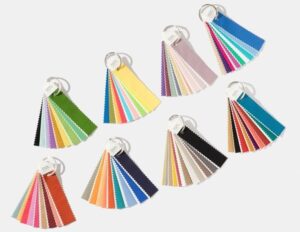
Pantone’s spring colour forecast.
The biggest of these predictions is that pastels may be on their way out, gradually being replaced by bolder and brighter hues.
Pantone says that “intense colours seem to be a natural application of our intense lifestyles and thought processes these days.”
So, where in past years we may have gone soft and subtle as an antidote to our hectic lives, perhaps we’re now embracing it more. However, we’re not likely embracing that intensity with abandon.
Many of the paint makers release colours of the year as well. Two of those definitely favour serenity.
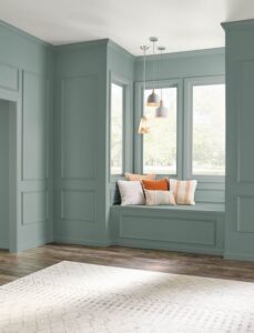
Beauti-Tone, a Canadian brand sold through Home Hardware stores, has chosen Green Peace, for what it says is the calm we are craving.
Beauti-Tone’s Green Peace.
The colour is meant to provide a connection to nature, and quiet “the noise and intensity” in our lives. Beauti-Tone even sees Green Peace as a new neutral, although don’t expect it to bump out whites, greys and beiges.
And for the first time ever, Behr Paint has issued a colour of the year, predicting In the Moment will be popular for 2018.
Behr’s In the Moment.
This is a blue-green hue honouring nature that, like Beauti-Tone’s colour of the year, Behr feels will be sought after for its soothing characteristics.
Black is the new black
Then there’s PPG, which is taking a decidedly different tack, although ultimately with the same aim. PPG announced earlier last year its colour of 2018 is Black Flame.
It’s actually a blend of black and navy, two classic colours, and PPG’s reasoning for choosing it is that black creates the silence we crave in an information-heavy world, while the navy offers possibility and a deep hopefulness. It also makes a great backdrop that lets other elements of your decor take centre stage.
The brand Glidden, which is owned by PPG, has also gone dark, choosing Deep Onyx and calling black the most forgotten neutral.
And Olympic Paints is also on board with the black trend, choosing Black Magic as its colour of the year for 2018.
- PPG’s Black Flame
- Glidden’s Deep Onyx
- Olympic Paints’ Black Magic
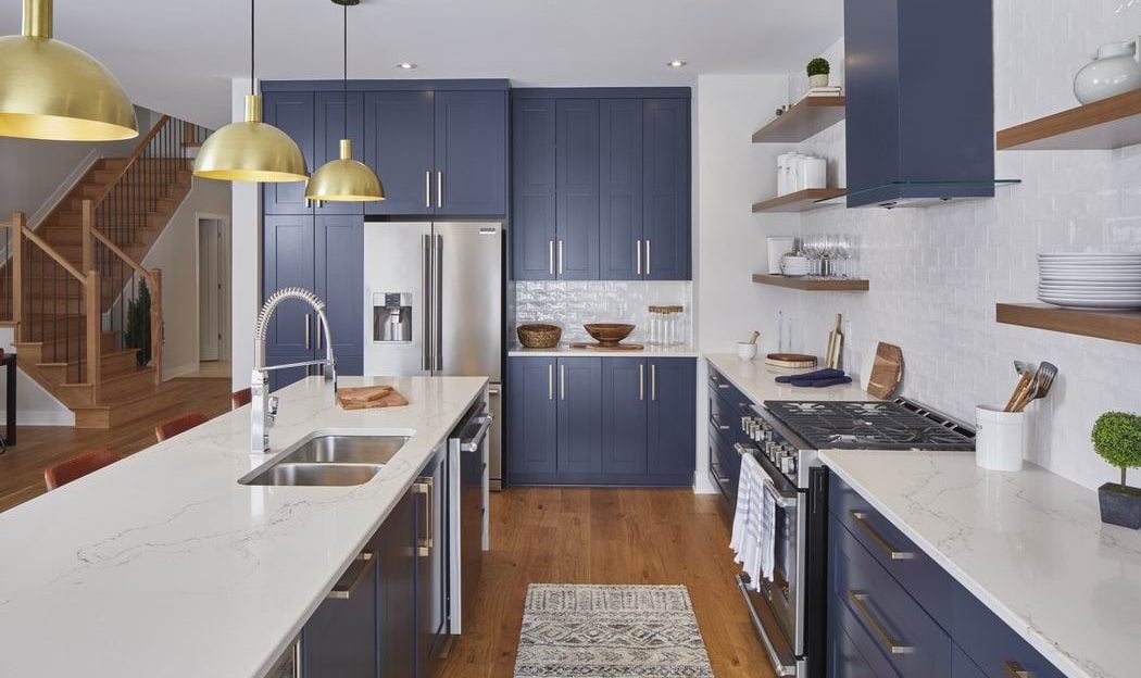
Black and navy are two colours that are increasingly popping up in designs.
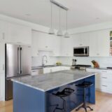
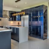
Interestingly, we’re seeing navy and other blues used in kitchens, particularly in projects that were entered in last fall’s Housing Design Awards.
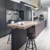
- Astro Design Centre. Photo by Doublespace Photography
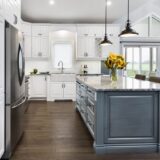
- Laurysen Kitchens. Photo by Metropolis Studio
- Artium/Deslaurier Custom Cabinets. Photo by Jessica Toczko
- Artium/Deslaurier Custom Cabinets. Photo by Jessica Toczko
- Deslaurier Custom Cabinets
- Urbandale/Kitchen Craft
So, what are we seeing besides colour?
Living the dream
We can take our cue from the CHEO dream home that was open for viewing through the fall. Making up the bulk of the grand prize in the Dream of a Lifetime lottery, the luxury home is built by Minto and stuffed with up-and-coming products and features.

2018 CHEO dream home. Photo: Brittany Gawley, courtesy CHEO Foundation.
While the 2017 home was a definite nod to Canada’s past, celebrating our 150th birthday as a country, it was anything but stuck in the past.
Banquette seating is an older, more traditional look, but it’s coming back. It’s an efficient use of space, can be a great storage area – if it’s designed for storage – and can be a great spot to curl up with a good book.
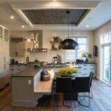
- CHEO dream home kitchen banquette. Photo: Brittany Gawley, courtesy CHEO Foundation.
- Amsted Design-Build
Also in the kitchen, the countertop used in this year’s dream home speaks to the continuing shift away from granite. It looked like quartz, which is today’s most popular choice, but was actually a porcelain sheet. This type of counter is 30 per cent stronger than granite, doesn’t react to heat, and you can’t stain or chip it.
Porcelain counters in the CHEO dream home. Photo: Brittany Gawley, courtesy CHEO Foundation.
Porcelain counters may seem like a new idea to us, but there’s a well-established demand for them in Europe, which is where many of our trends originate. It sometimes just takes awhile for them to hop the pond.
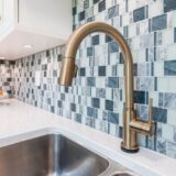
Fixtures in gold is not an up-and-coming trend, but it is current and will continue to be popular. Along with gold, brass is making a comeback, based on what was seen at the most recent influential Kitchen & Bath Industry Show. (But if you want to keep it classic, chrome and satin still reign supreme.)
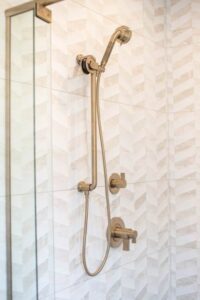
Gold fixtures in the CHEO dream home. Photo: Brittany Gawley, courtesy CHEO Foundation.
Our love of metals in general is one that continues, according to Pantone, and metallics in furniture, fabrics and art will grow.
Pantone also expects geometrics to stay hot. They add instant visual interest to a room, give it a fresh look and – despite its connection to the 1970s – feel modern.
Then there are wood treatments. Much like colours can connect us with nature, wood also helps us to feel grounded.
While wood treatments have also been trending for some time, look for them to show up in unexpected places, like the barnboard on the dining room ceiling of the dream home.
Other kitchen and bath trends of note from the Kitchen and Bath Show: Stone sinks are hot; two-tone cabinetry – again, this is not a new one, but it’s increasing in popularity, giving white kitchens a run for their money – and colour.
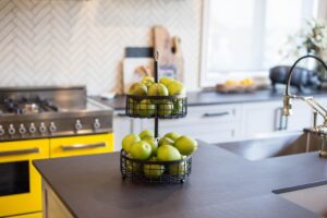
While blue was the dominant colour in kitchens, colour popped up everywhere, from faucets to cabinetry to appliances and sinks. It just goes to show that the jaunty yellow stove in the dream home was right on track.
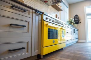
CHEO dream home. Photo: Brittany Gawley, courtesy CHEO Foundation.
Texture, particularly in tile, is hot. And even more so when it’s paired with colour, pattern or a unique design. This also speaks to the popularity of geometrics.
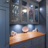
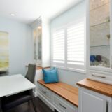
And finally, Beauti-Tone is also predicting country style will make a comeback, but it will be country without the clutter. Not a knick-knack in sight, this “country” will be a more modern take with a back-to-our-roots warmth that will help us create a space we feel safe in.
Country style. Project by Lagois Design-Build-Renovate.
