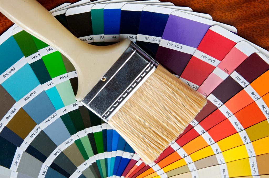
One of the most frustrating things for homeowners that they share with me is how challenging it is for them choosing colours for their home. They don’t know where to begin and want to ensure they make the right choices the first time.
Colours have energy, meaning and an impact on us. For many, choosing colours for their home can be very stressful. But it doesn’t have to be that way.
Here are some tips to help you with your colour journey.
Which direction does your room face?
The direction of your room will have an impact on the colour you select. Different colours suit different rooms, so the first step is to assess the direction of your space.
North-facing rooms
- Have a cooler natural light and generally less of it, so can sometimes feel a little dark and cold.
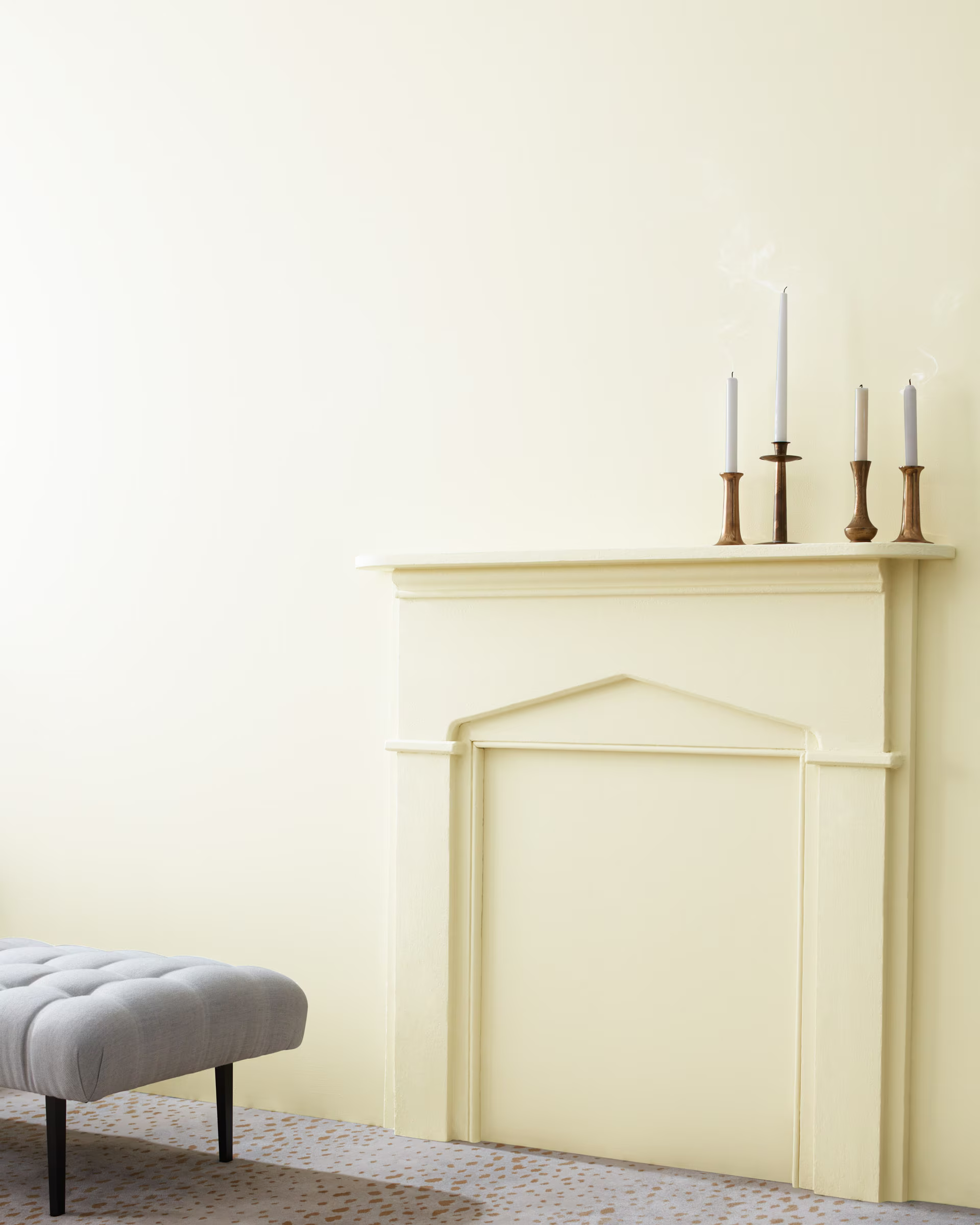
- Shades containing warmer tones, such as pink, gold or yellow, will help it feel more welcoming and cosy.
- Greys and whites that contain hints of pink, gold and yellow will add a more subtle warmth to your space.
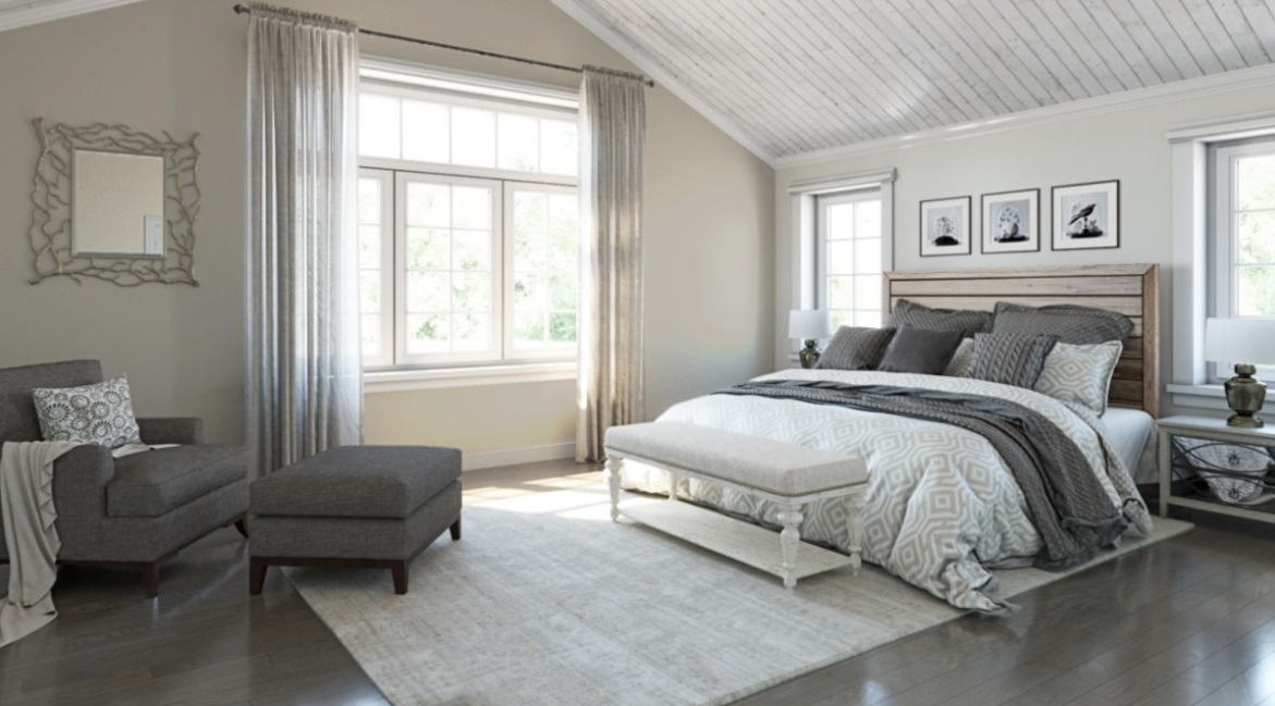
South-facing rooms
- If your room faces south, you can get away with most colours — even dark, dramatic ones.
- Spaces that face south enjoy strong, clear, natural light, so all colours work well. However, cool shades such as blue, green and violet balance the intensity of sunlight. These shades can help you achieve a tranquil and breezy atmosphere in even the brightest rooms. This also goes for greys and whites, too — those that contain hints of blue, green and violet will ensure the room doesn’t feel too “hot” without adding strong colour.
East- and west-facing rooms
- East-facing rooms will have natural light in the morning.
- West-facing rooms benefit from natural light in the early evening.
- These rooms will take some extra consideration when selecting colours. If the room is east-facing and mainly used in the morning or west-facing and mainly used in the evening, then cooler colours containing hints of blue, green and violet will help balance the intensity of the sunlight.
The percentages
Did you know there is a three-colour rule in interior design that can guide you when considering colours for your space?
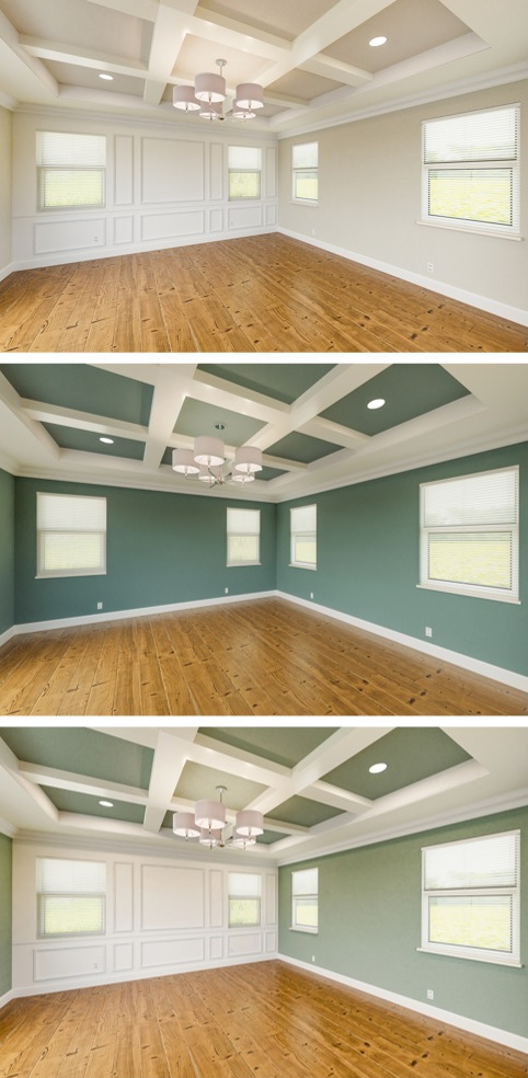
- The first colour is your main colour and should make up 60 per cent of the space.
- The second is still prominent, but not as much as the main colour, making up 30 per cent.
- The third colour is your accent colour and should be just 10 per cent.
Find inspiration for your colour scheme
For an easy way to create a colour scheme, base your choices on something you love. This could be a piece of artwork, an area rug or a patterned fabric. This gives you a good starting point.
As you choose colours, don’t forget to consider the value of the colour, which is separate from the 60-30-10 rule. Value refers to the lightness or darkness of a hue but doesn’t have a percentage attached to it.
A mix of values within your colour scheme helps to keep your room from looking chaotic. Try selecting one dark colour, one light colour, and one bright colour in each room. Choose clean and bright or soft and subtle.
Light & colour — the perfect combo
Colour is a reflection of light, so the kind and amount of light in a room will significantly impact a colour scheme. Experiment with how natural light or light from lamps affects colour in your fabrics, paint and furniture. Did you know that a white wall, for example, will take on the reflections from carpeting, ceiling colour and even the furniture?
- Incandescent lamps create a redder and warmer light than sunlight.
- Fluorescent lamps generally create a bluer, cooler light.
How colour affects a space
Lighter colours can make a small space feel more open. Dark colours can make surfaces appear closer, giving larger rooms a more intimate feel. Bright, cool whites can make a space feel larger and more open while warmer shades can make a space feel intimate and cosy.
A long narrow room will look wider if you use a slightly darker colour on the shorter walls and a lighter colour on the longer walls. You can make a ceiling appear higher by selecting a lighter colour or lower with a darker colour.
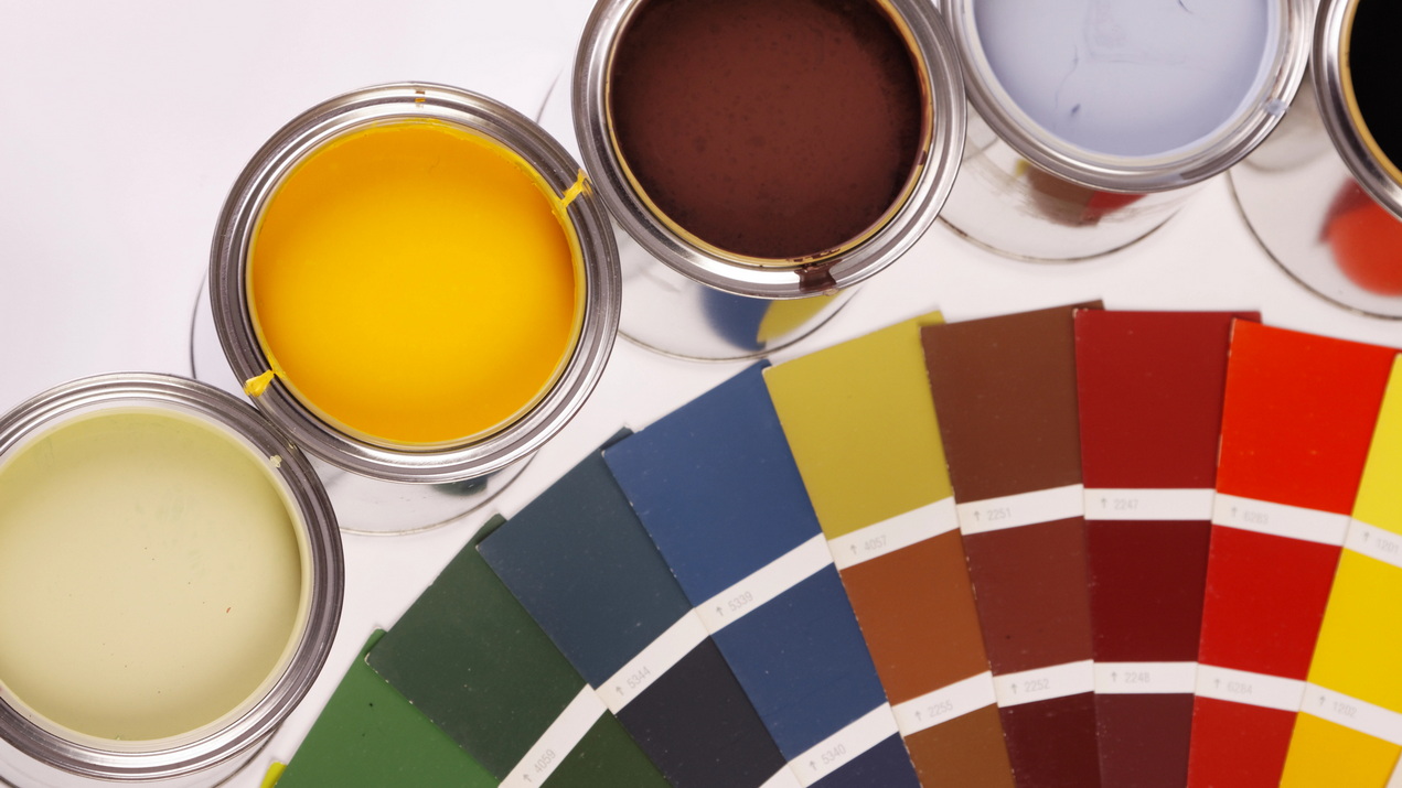
Tips for choosing colours
- Visit your favourite paint store, collect swatches and take them home. If you’re not sure which direction you want to go with the colour, choose several options.
- Gather your inspiration for your room (a piece of furniture, artwork, etc.) and place the swatches around it. Remove any you don’t like.
- Tape the swatches on the wall together so you can see the subtle differences in them. Again, remove the ones you are not happy with.
- Natural daylight changes from sunrise to sunset in each room. Be sure to move the swatches around the room as the light is different on each wall.
- Narrow down your selection to two.
- Sleep on it and then decide which is the colour for your room.
- Once your colour has been decided, it’s time to paint!
Because I am asked this a lot, I’ll leave you with two of my favourite colours:
Have fun choosing colours for your home.
