There are frequently big winners at Ottawa’s Housing Design Awards, but it’s not often someone makes such a big splash that they scoop up seven trophies in one night.
That’s what happened at last fall’s awards gala, where designer Nathan Kyle was barely off the stage after accepting one award before he was being called up for another.
“Everyone offered me a dolly” to carry out all the trophies, he said following the awards. “I think it was the standing joke.”
Although no stranger to winning — he has more than two dozen awards in his short career — he was taken aback by the outcome. “I was on a high, but it was mentally draining.”
A designer for the past decade at high-end firm Astro Design Centre, Kyle first came to attention in 2014, when he picked up four trophies at the Ottawa chapter National Kitchen and Bath Association (NKBA) awards.
Known for a refreshing contemporary flair but also comfortable doing traditional spaces, Kyle has broadened out from designing individual rooms to building and renovating his own homes and, more recently, acting much like the wedding planner of home design for clients who want him to handle everything, including choosing furnishings and art.
“We really direct the esthetic of what’s happening, everything from the interior to the exterior,” he says.
Not bad for someone who wasn’t interested in residential design, until he began to see the potential through Astro.
“I have this new-found respect and new-found passion for residential design. There’s something so personal about it and the fact that I am able to put my originality to a lot of the design work that I do… I’m very grateful for all the experiences I’ve had.”
Here’s a look at Nathan Kyle’s seven winning projects from the most recent awards, and what he had to say about them:
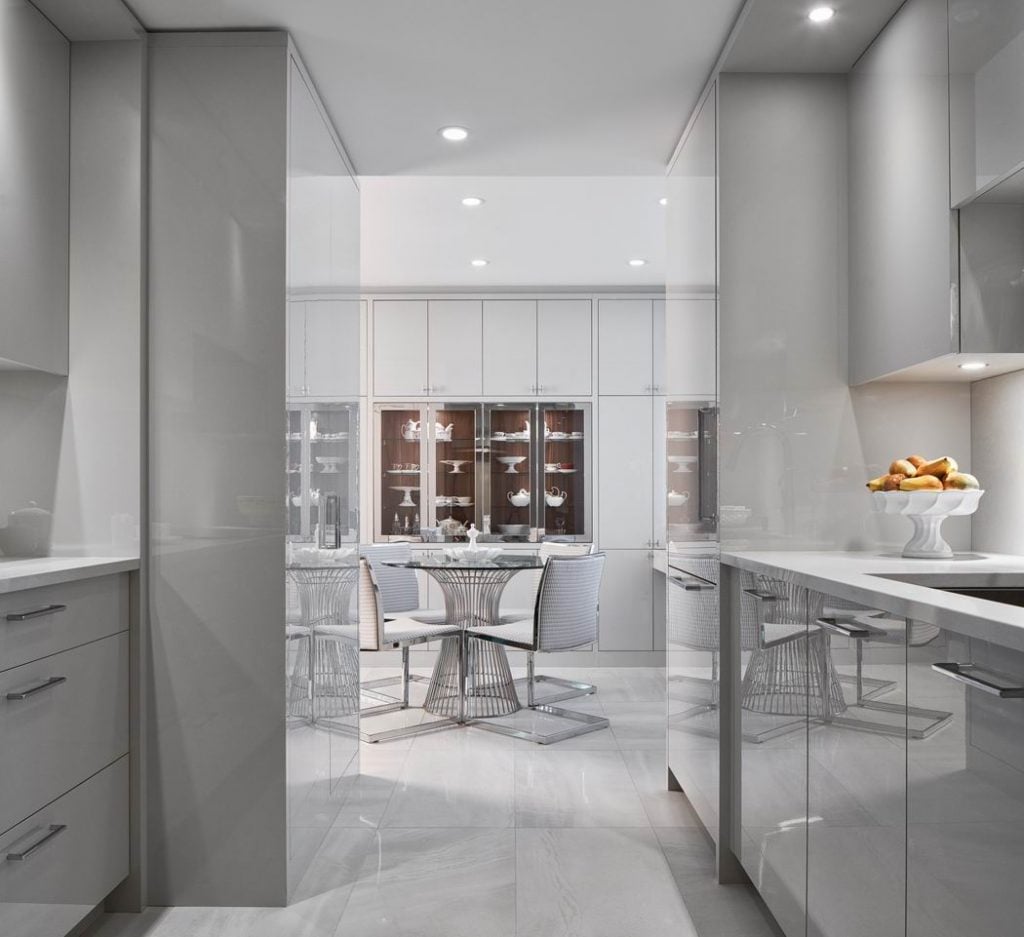
Project: Echo Drive condo
Award: Custom Kitchen (175 sq. ft. or less) – Contemporary
Design intent: This was a tired apartment that needed an update. The clients were retired empty nesters looking for high design and low maintenance.
The challenge: The compact space. The clients had moved from a large home to smaller square footage so the design needed to reflect that transition. We also needed to maximize storage. And the concrete walls, floors and ceilings, along with window placement, made for a limiting footprint.
On the result: Highly reflective surfaces promote the bouncing of light, while tone-on-tone finishes keep it airy and calm. A punch of detail visible from down the corridor creates a sense of depth, and elegance is created through the textures and play on materials.
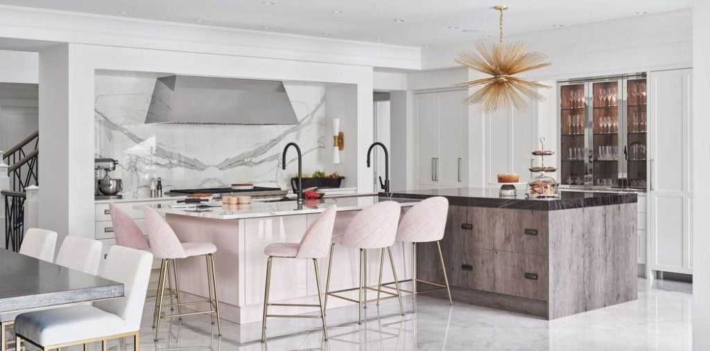
Project: Revelstoke kitchen
Award: Custom Kitchen (251 sq. ft. or more) – Traditional $75,001 and over – John Laurysen Memorial Trophy
Design intent: In this home, bustling family get-togethers are a daily occurrence with upwards of 10 to 20 people at any given time. I sought to design a room that was practical for the family’s lifestyle as well as creating dramatic vistas for an entertainer’s dream kitchen.
The challenge: The infusion of a blush tone of cabinetry (a request of the homeowner) into a space that we also wanted to feel timeless, and addressing the practicality of the space while delivering on luxurious design.
On the result: The kitchen has efficient work flows with the Galley workstation being the workhorse of the space. It has dramatic flair with the finishes and details.
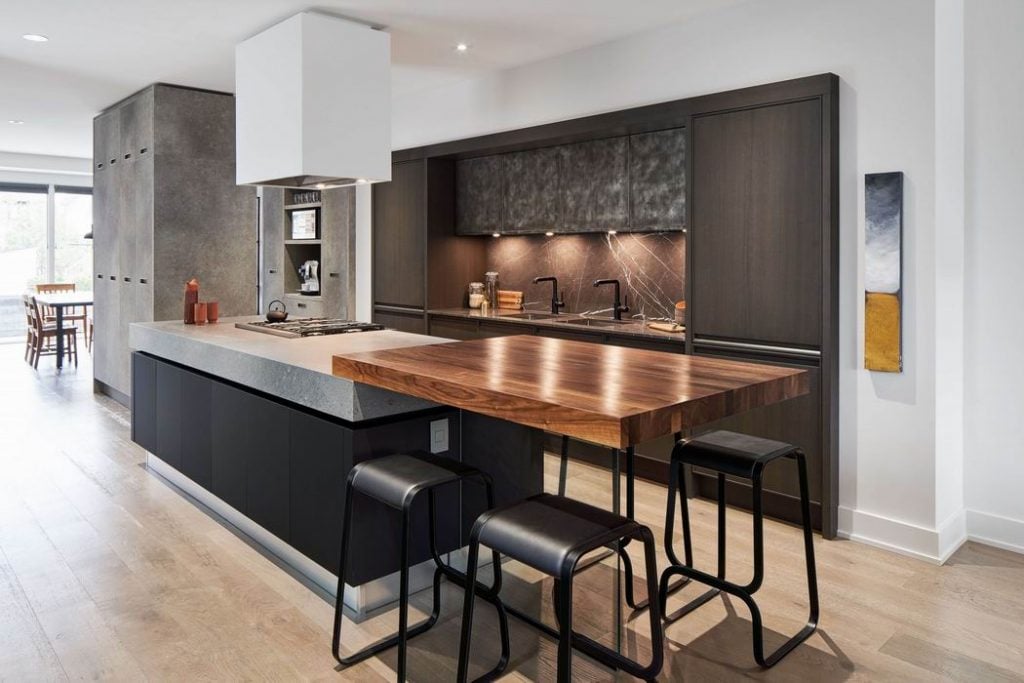
Project: Westboro infill, in collaboration with Hobin Architecture
Award: Custom Kitchen (251 sq. ft. or more) – Contemporary $75,001 and over
Design intent: Minimalism, but not boring
The challenge: Balancing the clients’ love of modern minimalism without feeling generic in modern design.
On the result: This project is high design details — the “floating” walnut butcherblock counter supported over tempered glass, integrated handles in a grey washed oak, aged steel door panels and smudgeproof galaxy black island cabinets. The minimalist hood fan blends into the ceiling and the textured concrete butler’s pantry, with panels that integrate the closet, creates a dividing space between the rooms.
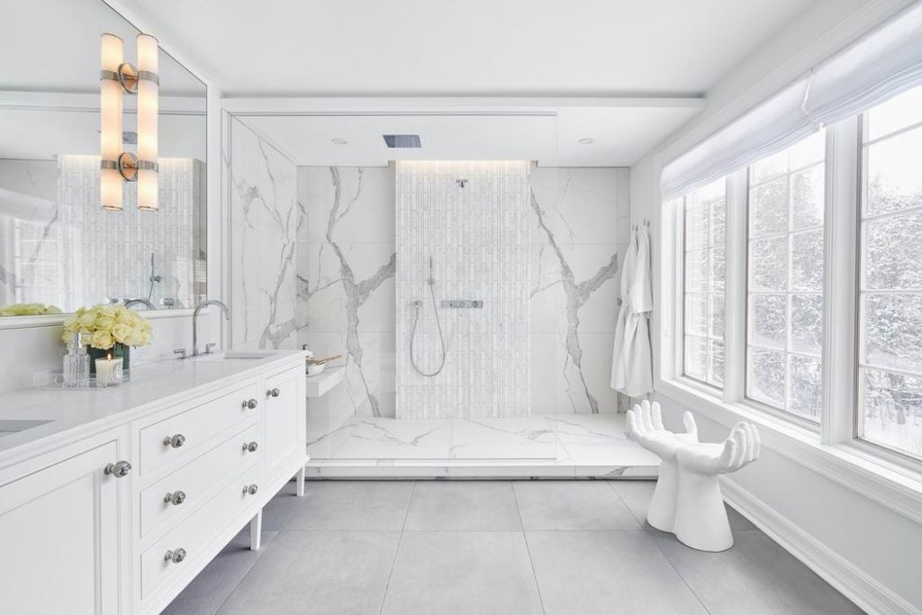
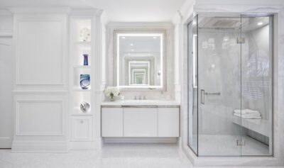
Project: Ensuite renovation
Award: Custom Bathroom (100 sq. ft. or less) – Traditional (this project also won an award at the NKBA awards last spring)
Design intent: Developing a classic but contemporary feel to a master bathroom
The challenge: Co-designing with an interior decorator — the push and pull of individual design esthetics to come out on top
On the result: This project is a harmonious blend of textures and details that make the space feel anything but trendy.
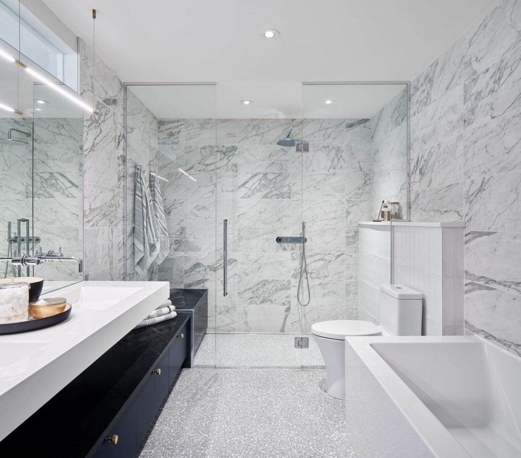
Project: Modern ensuite, in collaboration with Hobin Architecture
Award: Custom Bathroom (100 sq. ft. or less) – Contemporary
Design intent: Again, minimalism, but not boring. This is the same house as the Westboro infill kitchen. Here, I sought to create a compact master bathroom that addresses the wants and checklist of a typical master ensuite.
The challenge: This bathroom had a narrow footprint with no window. I also needed to hone in on the clients’ love for modern minimalism without feeling generic or too simplistic.
On the result: Creating minimalism without being boring involved floating masses, integrated benches, vanity storage and textures of terrazzo floors against the veining of hand-scraped marble.
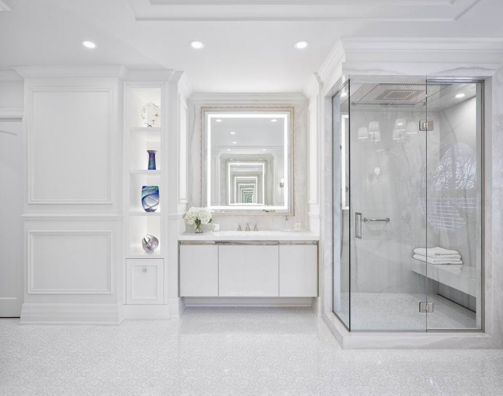
Project: Rothwell ensuite
Award: Custom Bathroom (101 sq. ft. or more) – Traditional (this project also won an NKBA award)
Design intent: Creating a heavenly and airy ensuite that is luxurious and dramatic without feeling gawdy.
The challenge: Renovating an existing bathroom of 20+ years and changing old habits to use the space differently — in orientation and practicality.
On the result: The heavenly look is created through white textures, applied mouldings, mirrored walls, artistic marble inlay floors, luxurious metals, crystal levers and low-maintenance porcelain slab walls. It delivers high design, his and hers stations, and the bathroom feels more voluminous by playing with whites in texture and finish.
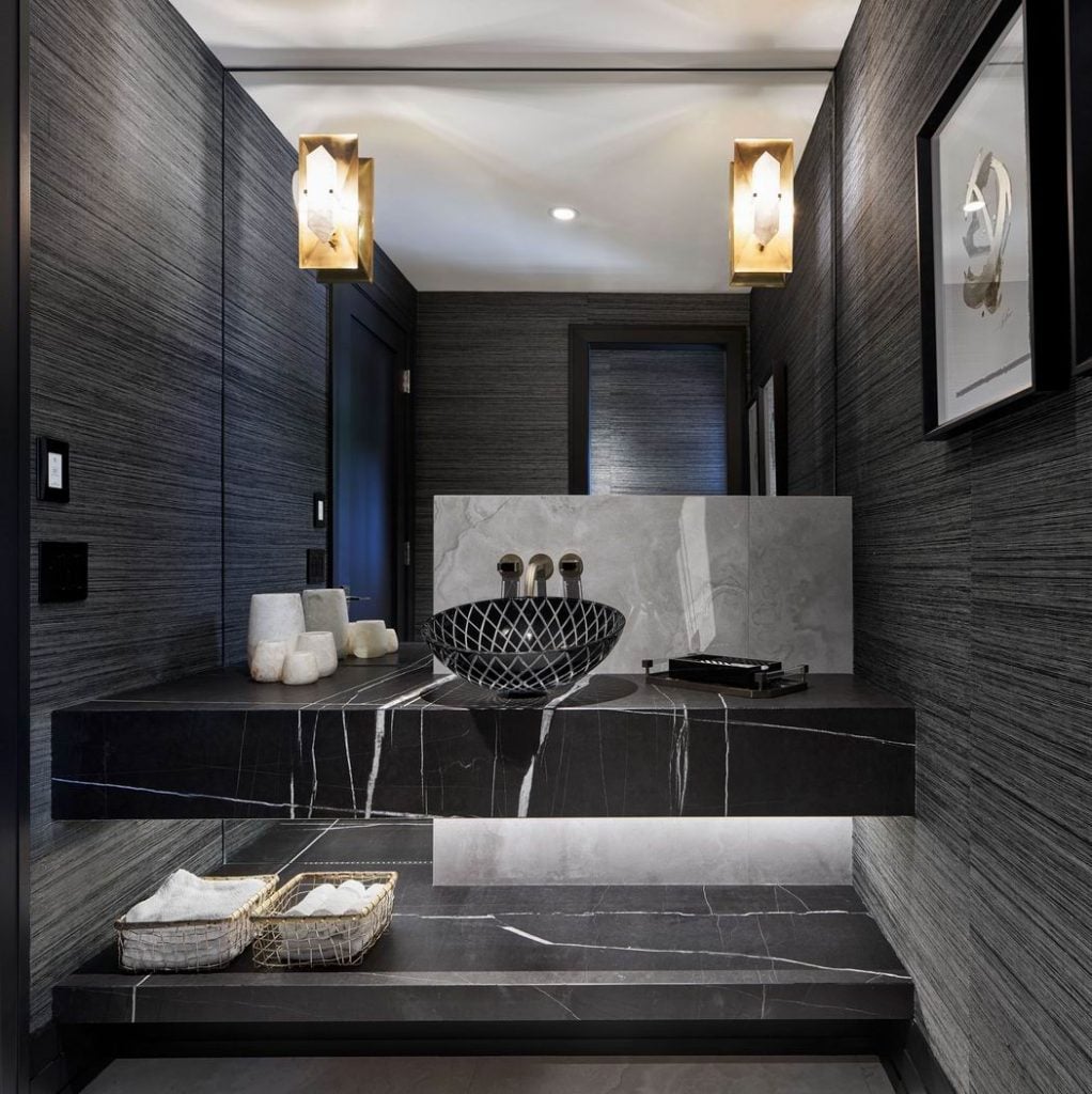
Project: Dramatic powder room
Award: Bathroom – Powder Room
Design intent: High drama for heavy traffic
The challenge: Developing a design around a black glass vessel sink with metal inlay.
On the result: The room is dark and very dramatic; it feels luxurious yet very durable thanks to the black and metallic threaded wallpaper and Marquina stone on monolithic-like slabs, with the airiness of having the slabs floating.

