For most of us, our home is the biggest investment we’ll make, so it’s crazy how often an addition will get plunked onto it without actually being thought through. While apprenticing as a carpenter, I saw so many additions that wrecked a house that, when I got into design, I promised myself it would not happen on my watch.
Folks seem to get seduced by magazine articles – what the industry calls house porn. Photographs show off great rooms with fantastic kitchens and lots of prep space that must surely be self-cleaning. We start imagining how the clutter that we’re always tripping over would magically migrate into its place – if it just had one to migrate to.
Feeling the pull
It’s so easy to get lost in daydreams about how great life would be with a two-storey bank of windows, a fireplace, quarter sawn oak floors, and a table that seats eight. It becomes easy to start thinking we need to add on.
In the 20-plus years I’ve been renovating homes, I’ve found there’s usually integrity to the initial design of a home – even if I don’t love it. But a poorly thought through addition wrecks a home every time. It demotes the existing house, which now seems stingy in relation to the grandeur of the addition.
Excellent design is the most eco-effective tool we have and it’s how we add all the value. Then we have to build smart and to last. It may seem like you can save money by just adding on without renovating the existing space, but you pay for that exponentially in loss of value.
Addition vs. renovation
So we start by encouraging families to reflect on what is valuable to them and then design each element to be in harmony with those values. By exploring everything a family needs and wants, without assuming the answer is an addition, we often discover more elegant solutions.
Take the example shown here. Living in a cramped space where you can’t make toast while someone is getting milk out of the fridge causes what I call Dysfunctional House Syndrome. It made this family feel like adding on was the only answer. They wanted to bump out the whole back of their house, even though it would eat up the beautiful backyard that they love.
Digging a little deeper, we realized their teenaged children would soon be leaving the nest, which meant a big addition did not make sense.
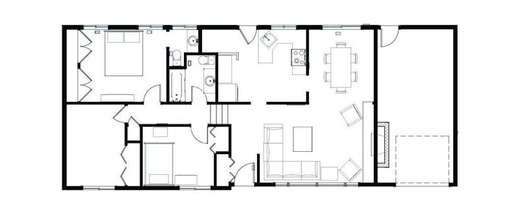
Before: It would be hard to design a more uncomfortable kitchen for a family of five.
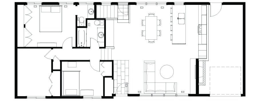
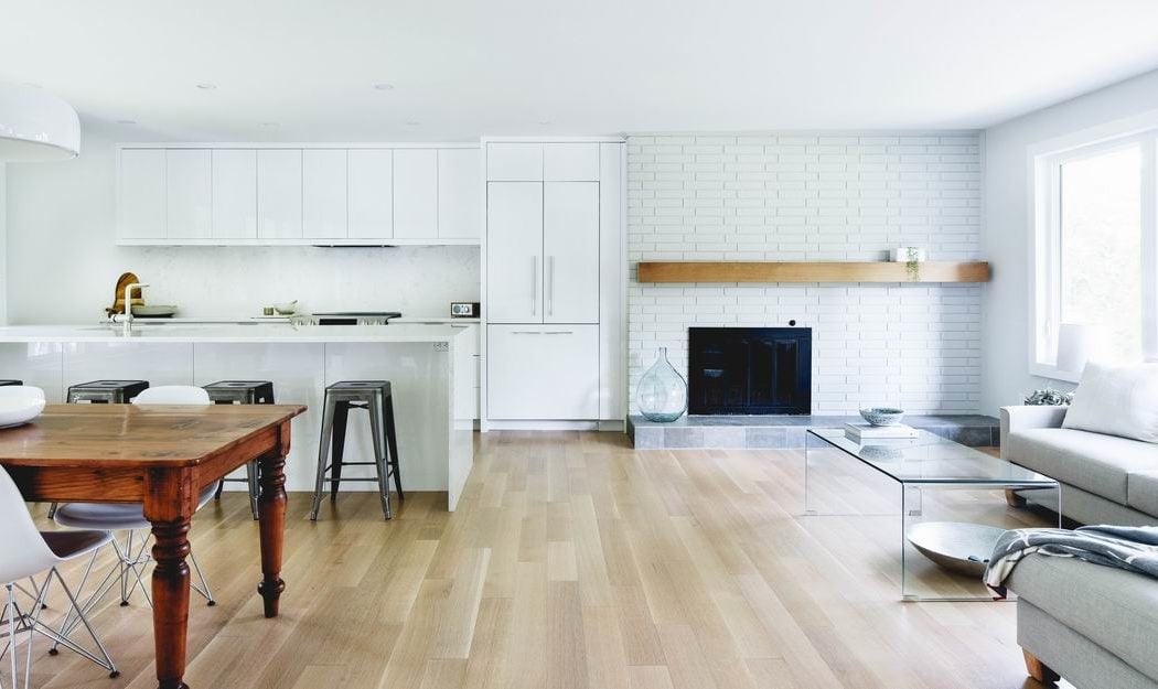
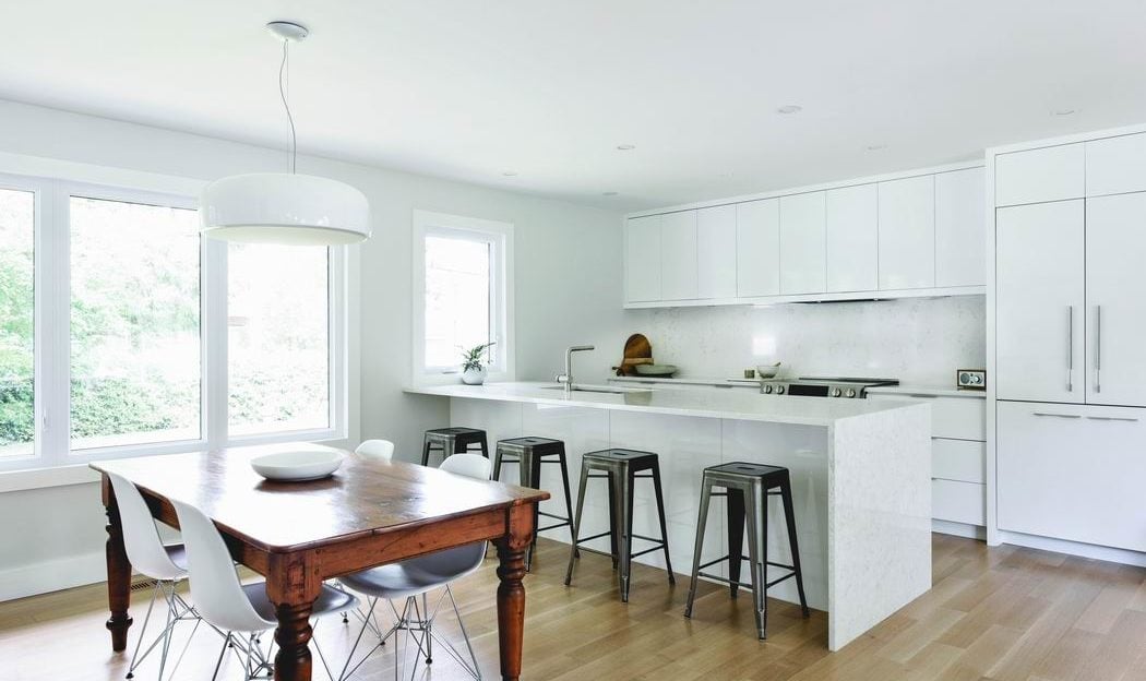
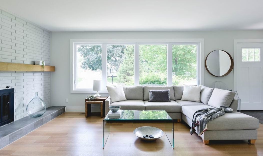
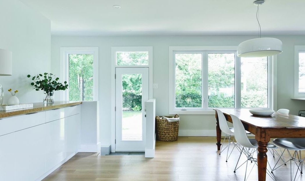
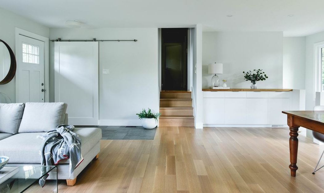
After: A modest addition into the garage allowed us to preserve their beautiful backyard and accommodate an elegant open concept that meets today’s lifestyle needs.
Just a little bit
Instead, adding a mere 28 square feet (a two-foot by 14-foot addition) and rearranging some existing space solved their issues. Plus, we were able to tuck that addition into the garage, still leaving room for a car, avoiding a change to the roof line and keeping their backyard intact.
The foyer was also redesigned and the main living spaces became open concept for greater efficiency. Although only slightly bigger in size, the redesign feels much more spacious, adding tremendous value for this family, and at much less cost.
Related
Keep your renovation from going off the rails
