Inspiring and energizing, the Pantone Colour of the Year is a great way to celebrate your home.
And celebrating your home is important because your living space is a reflection of you. Just like you have a favourite outfit that makes you feel confident and powerful, the way you decorate your home can inspire emotions and feelings like relaxation, happiness and comfort.
Incorporating colour is the best way to change up the feel of your home. So, if you are ready to refresh your space and inspire confidence, creativity and positivity, the 2022 Pantone Colour of the Year is the answer.
What is the Pantone Colour of the Year?
You’ve likely heard of the Colour of the Year before. Every year, the Pantone Color Institute — the world leader in colour matching systems — studies trends to pick a colour that represents the world around us. The Colour of the Year is influential in everything from fashion to product design to art — anywhere that colour matching is used.
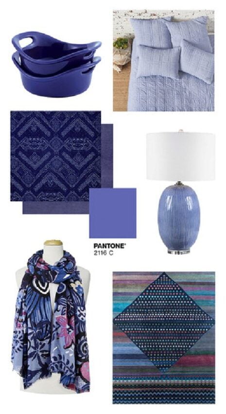
For 2022, the Pantone Colour of the Year is Very Peri (Pantone 17-3938). This colour combines a periwinkle blue with an energetic and exciting undertone of violet-red for a shade that inspires you to embrace the possibilities of the future.
How can you use the Pantone Colour of the Year in your home?
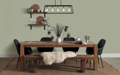
Bold colours help add a focal point to your space. They bring in energy and spark your creativity. Very Peri is ideal for home decor because it pairs both the calming properties of blue shades with the energy of red.
When bringing bold and exciting colours into your space, you want to find a balance between colours so your space is clean and inviting instead of overwhelming or chaotic.
Choosing a colour palette doesn’t have to be daunting, especially when working with a colour like Very Peri.
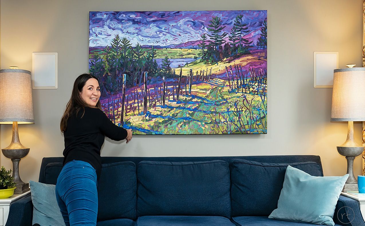
Inject colour with original art that brings the beauty of nature indoors
When providing full-service design, I love using artwork that you love as a starting point for a colour palette. Artwork inspires emotion and reflects the colours that make you feel relaxed, creative and happy.
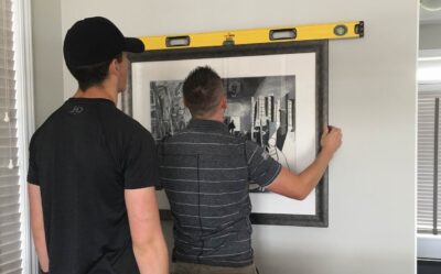
Custom artwork by a commission artist like Noémie L. Côté allows you control over the colours you want to feature in your home. She created a stunning original oil painting of Leystone Farms with the Colour of the Year 2022 as inspiration.
When you invest in personalizing your home with original art like that created by Noémie, you get to choose the beautiful natural landscape that you want to feature. Best of all, you get to show off a unique piece of art that inspires you.
Discover in this video how Noémie used the Pantone Colour of the Year to create her painting:
Be purposeful in choosing accents
Drawing inspiration from your original artwork allows you to bring colour throughout your space. What your space looks like will influence what works best to create that sense of balance and relaxation.
Whether you want to incorporate a lot of Very Peri in your decor or just accents throughout the room, there are plenty of options that allow you to surround yourself with this beautiful shade.