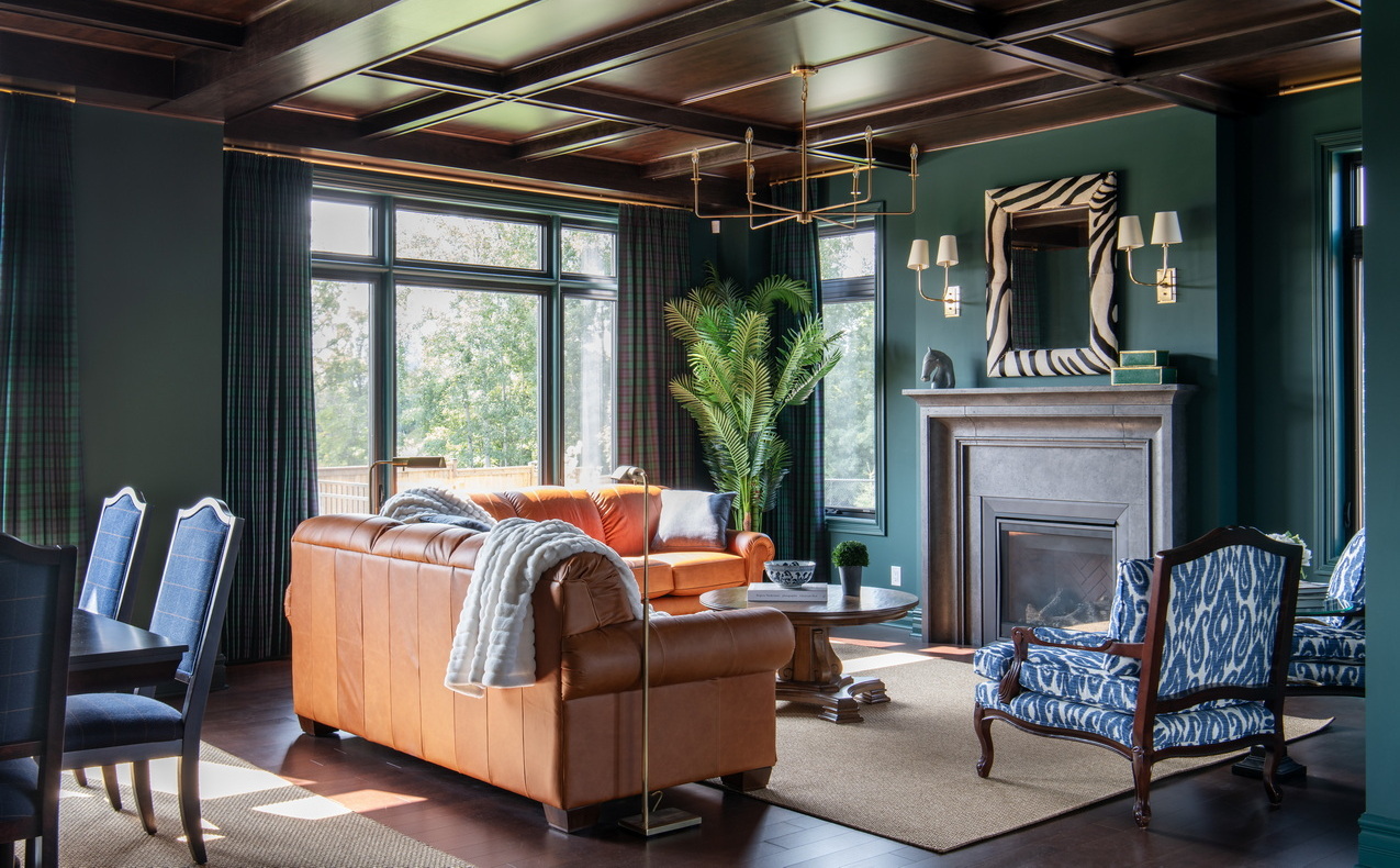
Moody, majestic and masculine: With the 2023 Minto dream home, designer Tanya Collins is going out with a bang.
After six years designing the interiors of the grand prize home in the annual CHEO Dream of a Lifetime lottery, Collins has decided it’s time to pass the torch and this year’s home will be her last.
“It’s a good time to pass on the reins to someone else,” she says. “It’s been a great run.”
The 2023 lottery launched on Sept. 6 with $5 million in prizes. The dream home makes up part of the $3.2 million grand prize.
Jump right to:
Visiting the home
Ticket info
The 2023 Minto dream home in photos
The floor plan
Collins took over the interior design of the dream homes in 2018 and since then has presented prize homes that ranged from Art Deco to Mediterranean coastal, Bohemian, mid-century modern desert and quintessential Parisian apartment. While the styles were all different, all were light and airy.
The 2023 Minto dream home is a departure.
“Last year was definitely more feminine and this is just the polar opposite of that,” she says. “Everything’s got solidity, whereas last year was a little more refined.”
The theme this year is British equestrian — the home is fittingly called the Equestrian — bringing in deep, rich walls, dark woods, lots of layers, coffered ceilings, elaborate trim and chunky furniture.
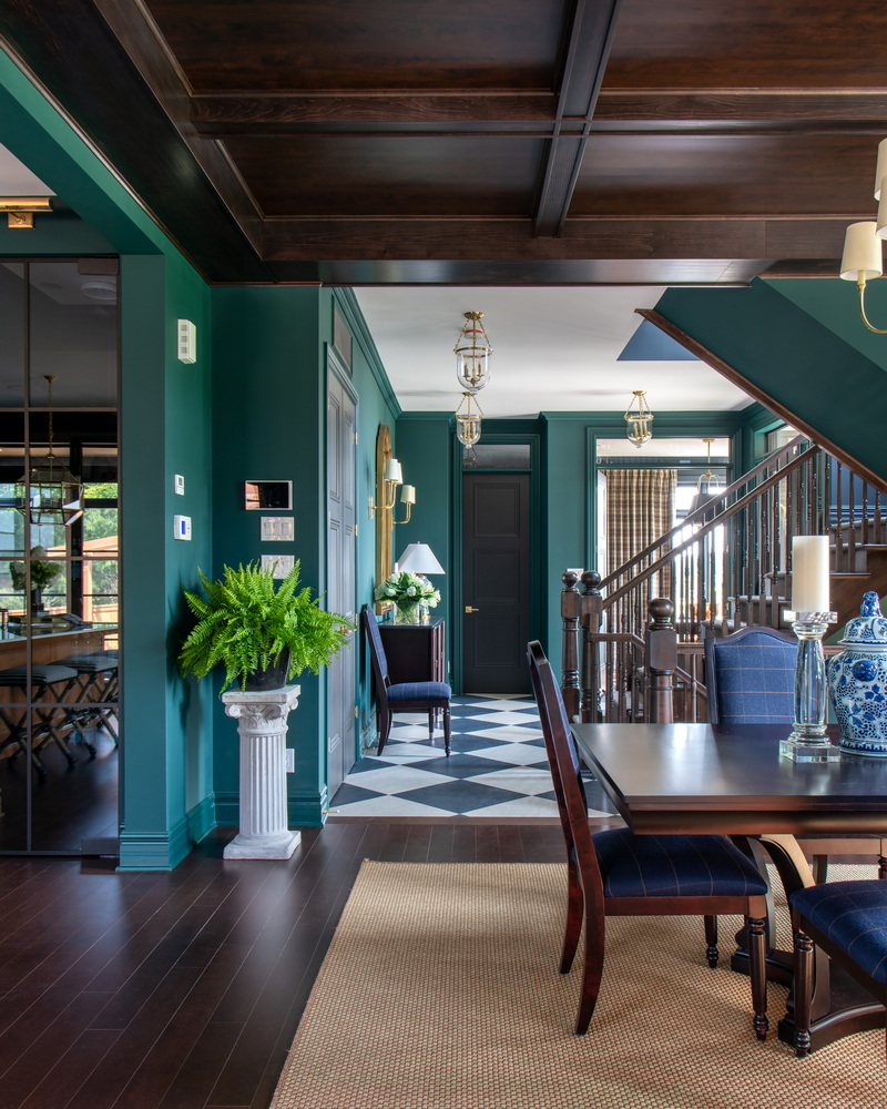
“It’s definitely moody,” Collins says. “This has a Ralph Lauren inspiration, I would say — luxurious, sophisticated, classic, very British.”
She uses a tight colour palette — camel, navy, dark green, rich burgundy — saturating walls, ceilings and furniture. “It’s all that classic men’s wear palette,” she laughs.
But while the feeling is deep and rich, there are plenty of windows to brighten the spaces.
The 4,383-square-foot floor plan (it jumps to 4,600+ when you add in the screened porch, upper deck and outdoor kitchen) is based on a Minto design from the builder’s Toronto portfolio, called the Evergreen 3. Karen van der Velden, Minto Communities Ottawa’s product development manager, chose it because it was something new for the Ottawa market and then made a few tweaks to turn it into a CHEO lottery home.
“The style of it with the roofline was really interesting and I thought it was a great fit.”
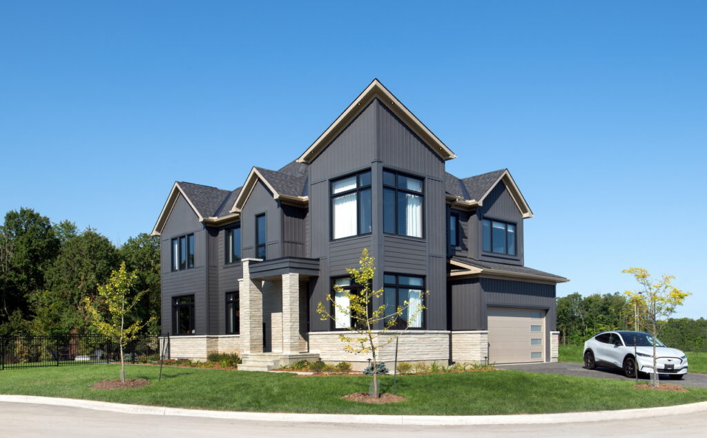
Built once again in Minto’s Mahogany community in Manotick, the home is a side-entry layout and positioned so that it captures the southern sun along the length of the home, where the front door and most of the windows are located. And set on a cul-de-sac lot that will have no neighbours along that sunny side (or in the rear, for that matter), the home is poised to soak in lots of natural light.
A street-facing corner of the home presents almost like the prow of a boat, creating an angular “turret” that adds definition and interest to the roofline. Much like the moody interior, the exterior is predominantly dark, done in an ironstone grey composite siding called Celect, in a board-and-batten style, with a sand-coloured stone skirt and fascia, and black windows.
Van der Velden expects to introduce a version of the floor plan to Mahogany.
The four-bedroom home boasts a main-floor office, open-concept kitchen, living room and dining room, a screened three-season porch, three full bathrooms and two powder rooms, a climate-controlled wine cellar, media room, private primary suite deck, geo-thermal heating and cooling, solar panels with battery storage and an outdoor kitchen.
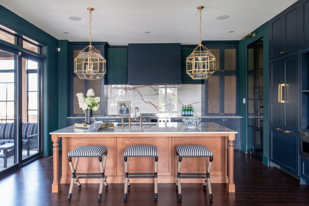
Main-floor walls are a deep green called Night Watch (Dulux), complemented by kitchen cabinets in a custom almost-black navy called Polo Blue. Collins, who designed the kitchen, which was provided by Laurysen Kitchens, then lightens the space with a birch island in a cinnamon glaze, Cosentino Dekton Awake counters with orange veining that also travel up the back wall to form the backsplash, and brass mesh inlays in upper cabinets “just to give it a little bit of luxury.”
Another unexpected touch is extra-tall pantry and mud room doors in mullioned glass, which Collins has done to provide separation but still bring in light. And if there’s concern about having to keep those spaces tidy because they can be seen through the glass doors, the glass can easily be frosted to still let the light through, she says.
The rich tones continue both upstairs and down, with the basement also done in the Night Watch green of the main floor and upstairs bedrooms done in burgundy, caramel and granite. The four bedrooms include two that share a jack-and-jill bathroom and a third with its own ensuite. The primary suite, meanwhile, is all about pampering, with a king-size leather bed (all furnishings are provided by La-Z-Boy), a private deck, a combined makeup station and bar with mini fridge — “You can get your drink and go out to the deck and sit,” Collins says — and a sumptuous ensuite that van der Velden revised to make it dream home-worthy.
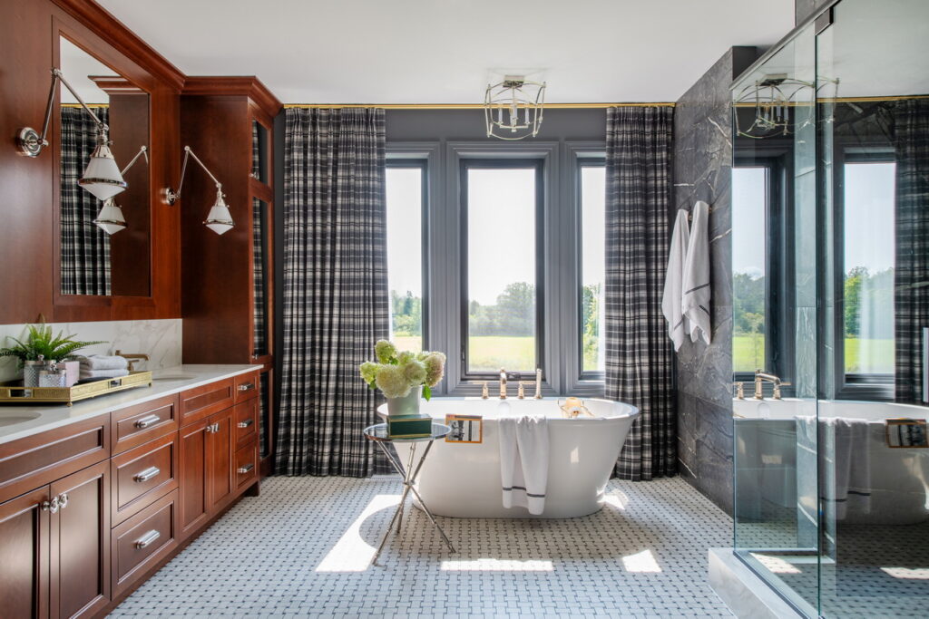
“I think it’s got the longest vanity we’ve ever done,” at about 14 feet, van der Velden says. “I’m really excited about that ensuite.”
Along with the long vanity, a standalone tub takes centre stage under a trio of windows while marble-like oversized tile covers the length of the shower wall.
“It feels like an old luxury hotel,” Collins says.
She feels it’s a good home to wrap up her dream home designing run. “It’s very different, it’s definitely dark and a departure from what we’ve presented in the other five years where it’s been very light and fresh … I’m very proud of how it came together.”
Touring the home
The dream home is open until Dec. 15 on the following days and times:
- Tuesday to Friday: noon to 8 p.m.
- Saturday and Sunday: 10 a.m. to 6 p.m.
- Closed Mondays.
It’s located at 364 Flare Grove off Century Road East in Manotick. There will be signs.
There is no charge to visit the home and no appointment is needed.
Not able to see it in person? By the end of September, there will be a 3D virtual tour on the lottery website that allows you to walk through at your own pace and as often as you like. The virtual tour will also include extra details such as a design studio that identifies materials used in the home.
(Editor’s note Sept. 15: The virtual tour is now available.)
Getting your ticket
As it has been for the past few years, tickets are $100 each or 3 for $250. The 50/50 tickets, which can be purchased if you have a lottery ticket, are $10 each, five for $25 or 15 for $50. There are also packages that combine lottery and 50/50 tickets.
Tickets can be purchased online at dreamofalifetime.ca, by phone at 613-722-5437 or 1-877-562-5437, or by visiting the dream home (no cash or cheques taken). The lottery runs until Dec. 15.
For more information, visit dreamofalifetime.ca.
2023 Minto dream home in photos
Main floor
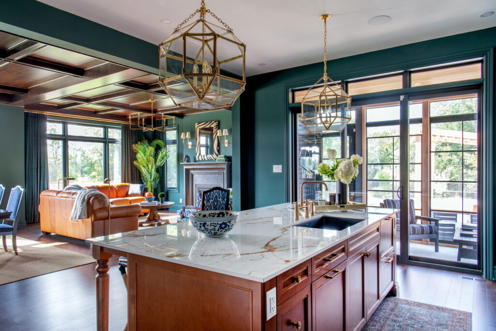
“It’s a really unique looking home,” says Steve Read, who is president and CEO of the CHEO Foundation, which runs the lottery. “It almost gives you the impression you’re going into a castle or an old manor estate.”
When asked what he thinks will appeal to the public, he cites the feeling of openness on the main floor. “It’s a home that you can imagine entertaining in both indoors and out.”
That open-concept space of the kitchen, living room and dining room “are combined a little bit differently, not in their usual linear positioning,” says van der Velden, who says the screened porch off the kitchen is one of her favourite spaces in the home.
Collins, meanwhile, who dreads being asked every year what her favourite space is, claims to not favour one spot this time, but concedes: “I love the kitchen, how it came together; the whole main floor I actually really like.”
Foyer
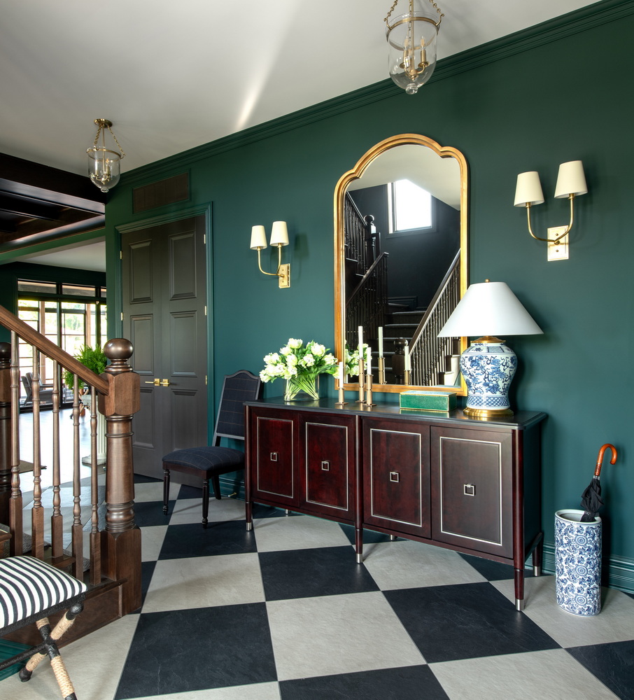
The side-entrance layout of the home allows for flexibility in the foyer.
“It is different … it makes for a nice grand hall,” says Collins.
It also means the 10-foot ceilings on the main floor, with accompanying nine-foot interior doors, are immediately apparent. (The second floor and basement have nine-foot ceilings.)
The 24×24 checkerboard tiled floor is carried through the area, connecting the powder room and the hallway closet so that it would be practical to walk with outdoor shoes throughout the space.
Collins also brings in arches — which are both trending and in keeping with the home’s design theme — through mirrors.
“I was trying to mimic, as much as possible, a very grand mirror that’s almost Louis-esque, that’s almost as ornate,” she says.
And she adds wall sconces in several rooms, including the foyer, to add mood and softness.
“I’m a freak about lighting, always have been.” Using sconces, she says “is like sitting by the fire … it’s a warm light, cosy feeling. And sconce lighting and lighting at various heights brings that mood and cosiness while still lighting the space. I find I’m moving away as much as possible from recessed (or pot) lighting.”
Office
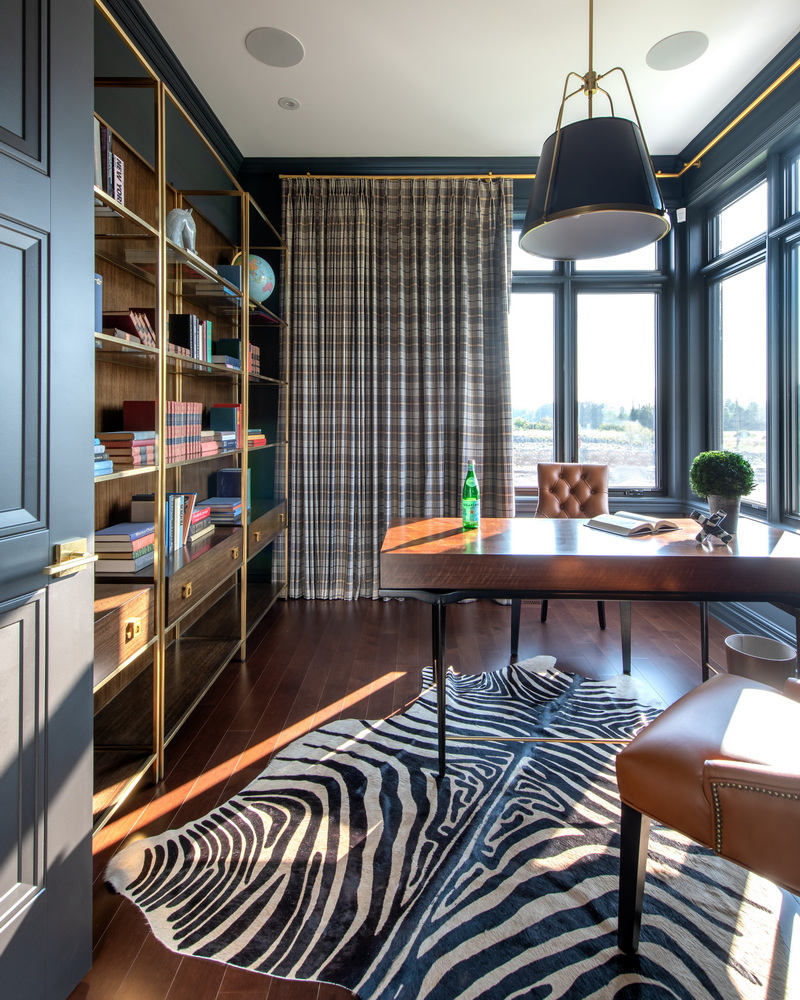
The office is to the right of the foyer at the front of the home, sitting in the square turret. As such, it has extensive windows across two walls.
“It’s very bright. It’s partly successful because of the lighting and all the windows,” Collins says. “It’s very rich and layered; it looks stately.”
Flooring here and throughout the home is a Vintage brand of hardwood called Rembrandt Pearl, supplied and installed by Rome Flooring,
“This is not a farmhouse look; it’s a little more urban,” Collins says.
Dining room and living room
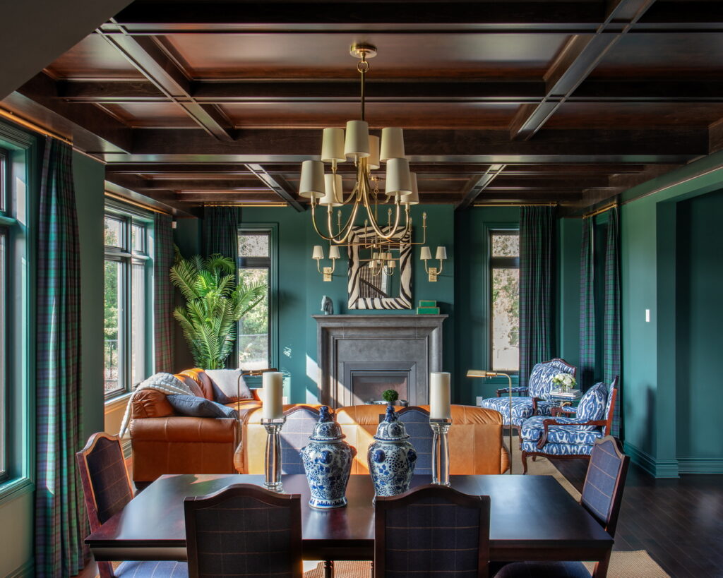
“I think people will appreciate the layers of this house and the custom details,” says Collins, who notes that darker woods are coming back.
She opted for coffered wood ceilings in the living room and dining room to add another layer to these formal spaces. And a custom fireplace mantel from City Plastering is made to look like old stone.
“It’s a brand-new house but it looks as if it’s old, there’s a lot of character, it looks like it’s been here for awhile.”
As the colder season approaches, “I feel like it’s a Christmas home. It’s warm; it’s cosy; it’s luxurious. And I think it feels livable.”
Kitchen
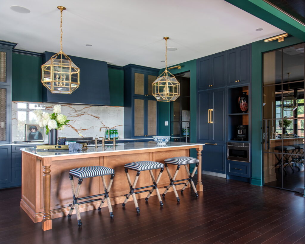
Integrated appliances and custom details that Collins added such as the brass mesh inlay on the cabinets that flank the cooktop give a little bit of luxury to the kitchen.
Van der Velden also reworked the kitchen layout, made it deeper and added a large walk-in pantry.
There’s a subtle difference in the deep green wall colour and the equally deep blue cabinets. “It’s just playing with nuances,” Collins says.
The orange veining in the counters and backsplash “integrates beautifully” with the wood tones, with the caramel leather in the adjoining living room, and with the camel colour (called Confidence) that she painted in the pantry and the mud room.
“It all sort of integrates; it’s all from a very tight colour palette — camel, navy, dark green and this rich burgundy tone.”
Primary bedroom
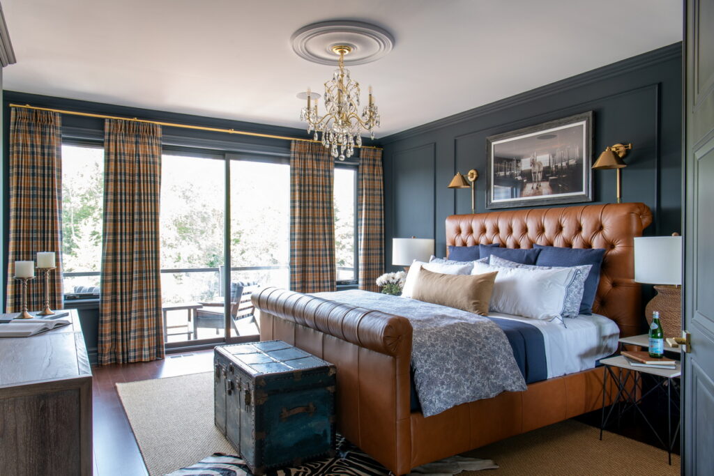
Although not overly large, the primary bedroom is sumptuous, and when you add in the various elements of the primary suite — private deck, walk-in closet, makeup station and bar area, ensuite — there is the feeling of being pampered.
Walls, which include moulding for a panelled effect, are done in a granite with navy undertones called Witchcraft, and the king-size leather bed is “pretty wow,” says Collins, who paired it with thin-profile nesting tables to keep the space from feeling too heavy. “This just lightens it up a little more.”
Also lightening things up is a floor-to-ceiling mirror (not shown) to bounce the light around.
Primary ensuite
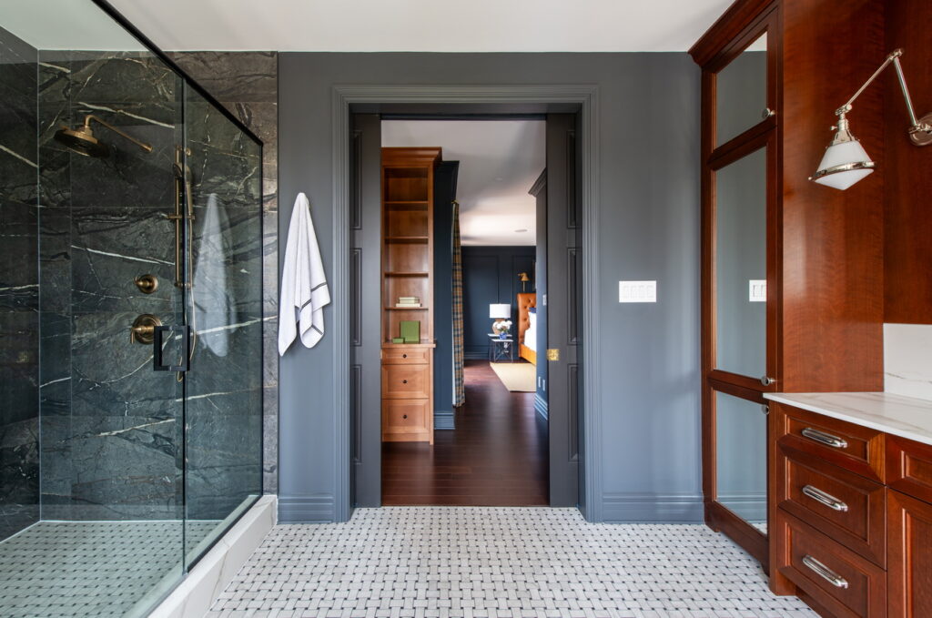
“It’s a moody bathroom; the colours are quite rich,” says Collins.
The glassed-in shower stretches down one wall with the water closet tucked in beside it and the whole wall is covered in oversized marble-look tile called Amaranto Black from Euro Tile & Stone.
The opposite wall features a double vanity stretching the length of the room, done in an amaretto wood with matching mirrored linen closets at either end.
In between is the soaker tub (not shown), which sits under a bank of windows on a floor done in a Panarea Centuries basketweave pattern and fronting walls done in a dark charcoal called Knight’s Armor that picks up on the flooring.
“I’m really excited about that ensuite,” says van der Velden.
With the adjustable vanity wall sconces, the tub’s decorative light and pot lights, “we have lots of different layers of lighting,” Collins says.
The caramel bedroom
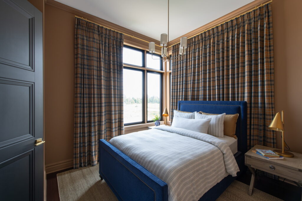
One of three secondary bedrooms, this room boasts corner windows with plaid curtains acting as a “wall” so that the bed can be positioned to allow for night tables on either side. Walls are done in the same Confidence colour that’s used in the kitchen pantry.
The twin bedroom
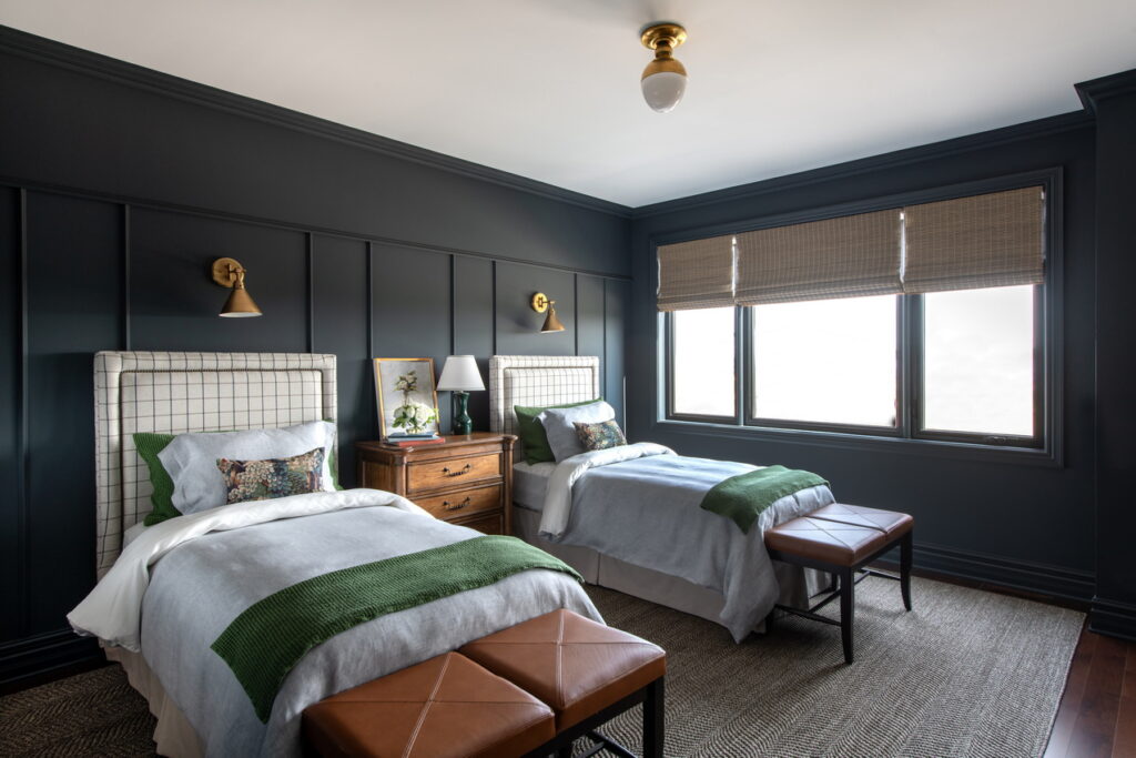
Bedroom No. 2 is large enough for twin beds and repeats the Witchcraft granite wall colour of the primary suite. However, the wall moulding treatment here suggests a subtle high wainscoting effect, adding texture and visual interest.
Jack-and-Jill bathroom
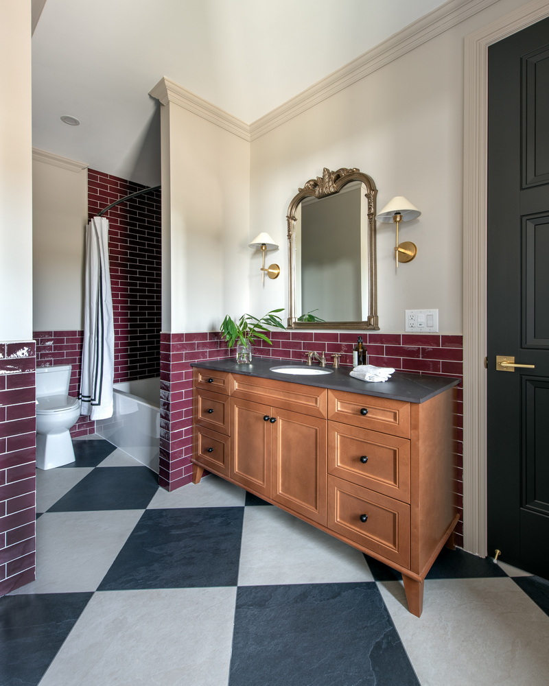
The caramel and twin bedrooms share a Jack-and-Jill bathroom that repeats burgundy tones found in the fourth bedroom and the laundry room, as well as the checkerboard tile pattern of the foyer.
Collins takes an interesting approach with the wall tile, using it like wainscoting that then continues through to the tub surround.
The room also includes a makeup station under the window (not shown) to offer a roomy bathroom space for the bedroom occupants.
The burgundy bedroom
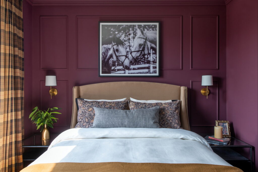
Located above the office, the burgundy room sits in the upper portion of the square turret and boasts a vaulted ceiling as a result.
Warm and welcoming in a wall tone called Gooseberry, it’s in keeping with the tight and rich colour palette used throughout the home. This room has its own ensuite, making it perfect for a guest room.
Burgundy bedroom ensuite
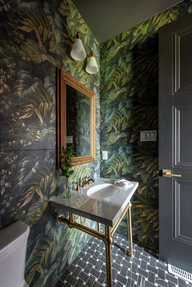
The burgundy bedroom’s ensuite features a classic European-style sink and an unusual wall tile that Collins used like wallpaper.
“It has sort of a jungle look,” says van der Velden.
Laundry room
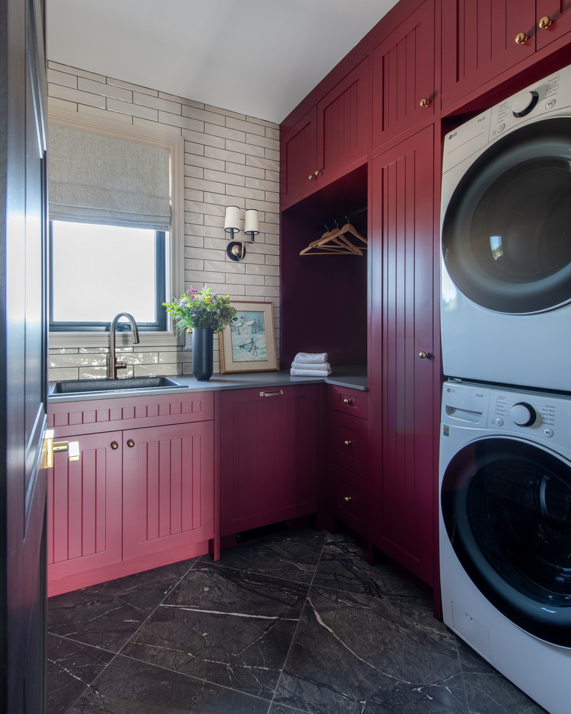
Van der Velden enlarged the laundry room and Collins reconfigured it to make the most efficient use of the space, stacking the washer and dryer and making sure there was plenty of storage and counter space.
“It has everything you need,” says Collins.
It repeats the tile from the primary ensuite shower and the cupboards are a custom burgundy called Raisin Torte.
Media room
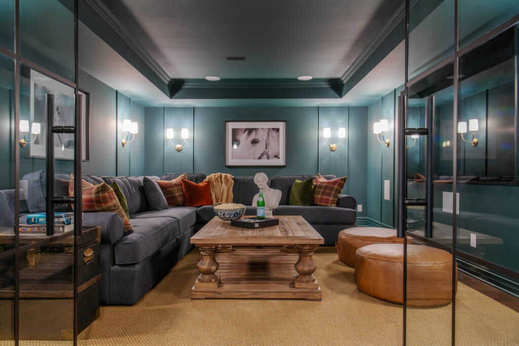
The media room gets a double-door entry in mullioned glass to give it more of a heritage effect, Collins says. The room repeats the dark green wall colour of the main floor, which is also used on the cove ceiling, creating a cocoon-like space.
“It’s good for watching movies.”
Wine cellar
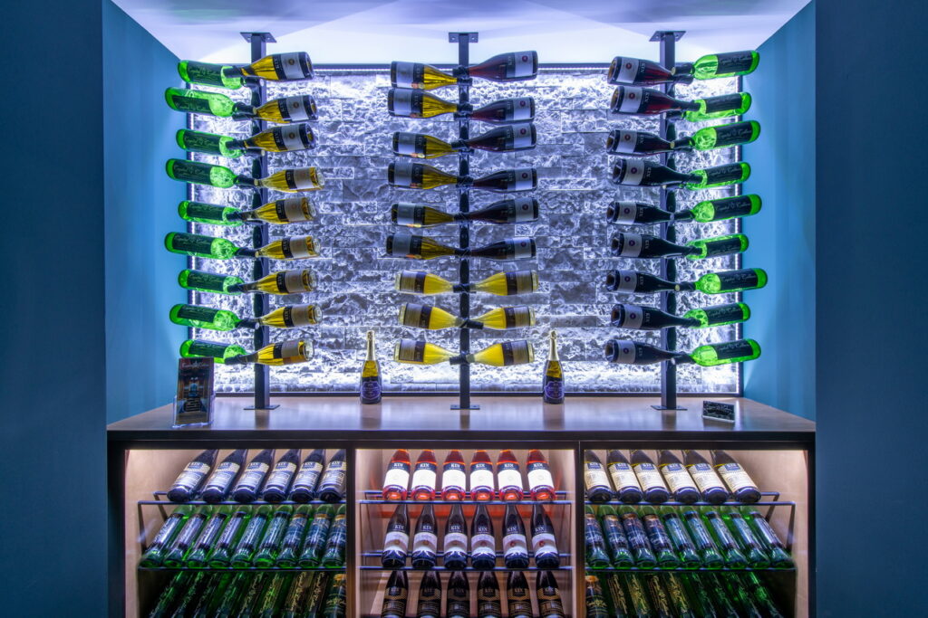
The basement includes a climate-controlled wine cellar provided by Capital Cellars and an accompanying lounge area for wine tasting and conversation (not shown).
“It’s a great spot for entertaining,” says Read.
Outdoor kitchen
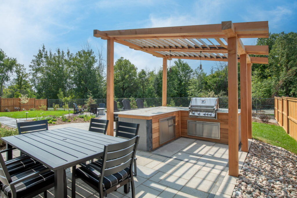
The wish list for this year’s home included an outdoor kitchen that designer Michael Farrow from Thunderbolt Contracting located close to the screened-in porch to be close to the kitchen and to create the effect of an extension of the house.
He took inspiration from the home’s roofline for the pergola, which is done in Douglas fir with louvred cedar slats.
“The whole project was very much inspired by the architectural choices in the building itself,” he says.
The backyard
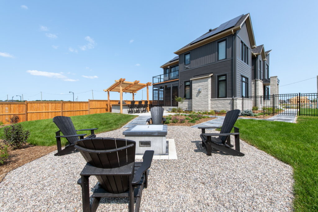
Located on a pie-shaped lot on a cul-de-sac with no rear or side neighbour, the expansive backyard includes a fire pit conversation area, along with the outdoor kitchen and screened porch.
“We’ve focused on the outside a little bit this year,” says Read. “The home itself is in an area that provides a lot of quiet around the house as well.”
The garage
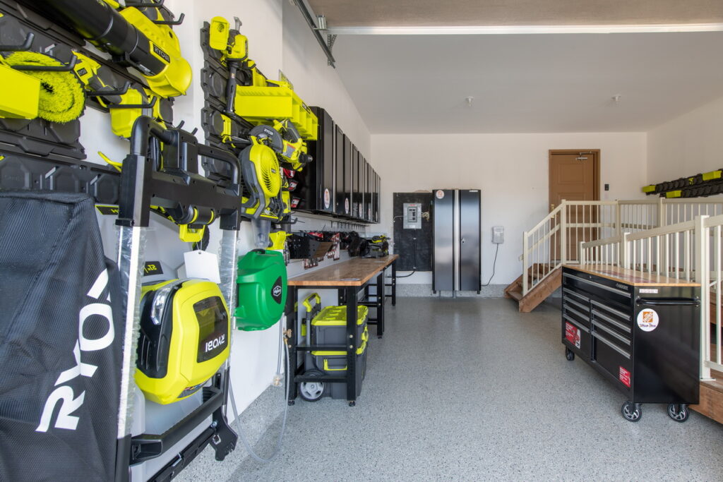
Another change van der Velden made to the original floor plan was to lengthen the garage, which is done partially to accommodate an accessible ramp for lottery visitors.
The garage is also stocked with tools supplied by Home Depot.
The floor plan
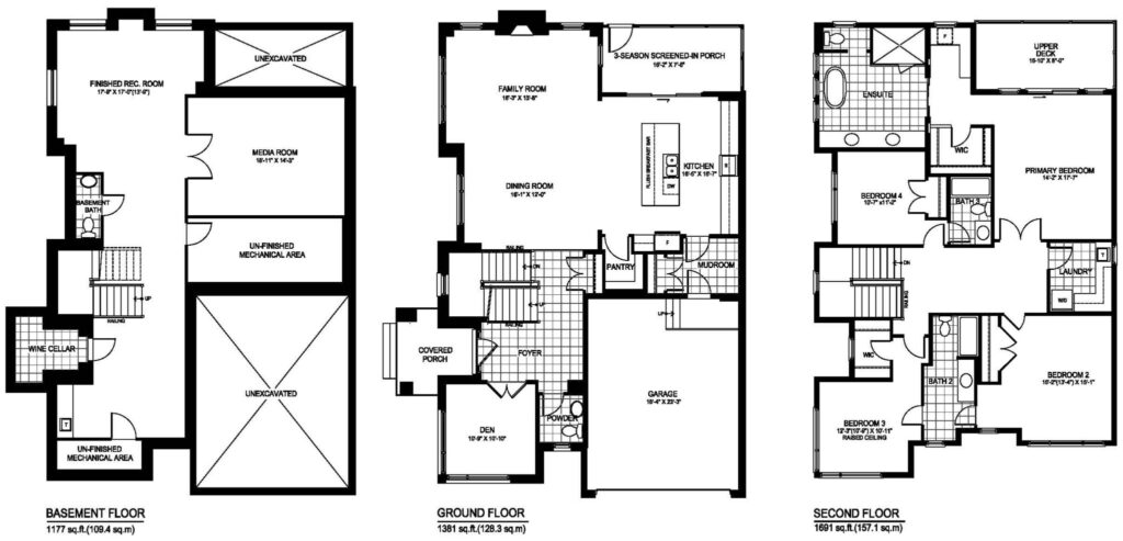
The floor plan includes more than 4,300 square feet between the three finished floors. Add in the screened-in porch and the upper deck and that jumps to more than 4,500 square feet.
The finished basement includes the enclosed media room, a games area with pool table, a powder room, a climate-controlled wine cellar and a conversation lounge with wet bar.
The main floor is a side entry with the home office and staircase flanking the front door and the powder room tucked beside the office. From the entry, the home moves to an open-concept dining room, living room and kitchen, with a walk-in pantry, a mud room connecting the garage and kitchen and the three-season porch.
Upstairs there are four bedrooms, one off each corner of the hallway — a primary suite with walk-in closet, makeup/bar station, private deck and ensuite, two bedrooms sharing a Jack-and-Jill bathroom and a fourth bedroom with its own ensuite. The laundry room is also on the second floor.
“It’s so nice to see it come together,” Collins says of the home.
