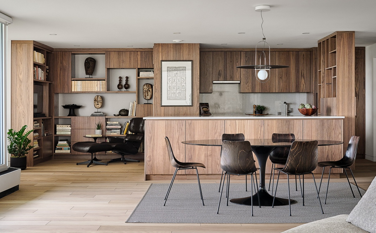
An award-winning condo renovation in a 1970s building overlooking the Rideau Canal starts and ends with the owner’s art collection.
Of course, there was also consideration for how to seamlessly downsize while creating efficient, multifunctional spaces, but influencing it all was the art.
Owner Annie Brisset “was really particular about the art pieces she would like to see in the space,” says architect Conrado Canolo of Simmonds Architecture, who was the project’s lead designer. “That’s why we created a space where we can showcase her pieces, pretty much in every part of the house.”
The project, which also included contractor Crossford Construction and millwork provided by Cedar Ridge Designs, scooped up four awards at last fall’s Housing Design Awards put on by the Greater Ottawa Home Builders’ Association. It won its renovation category, best condo suite, best home office and its kitchen category.
“It was just a superlative renovation,” judge Chris Lemke of Calgary’s Alloy Homes said at the time.
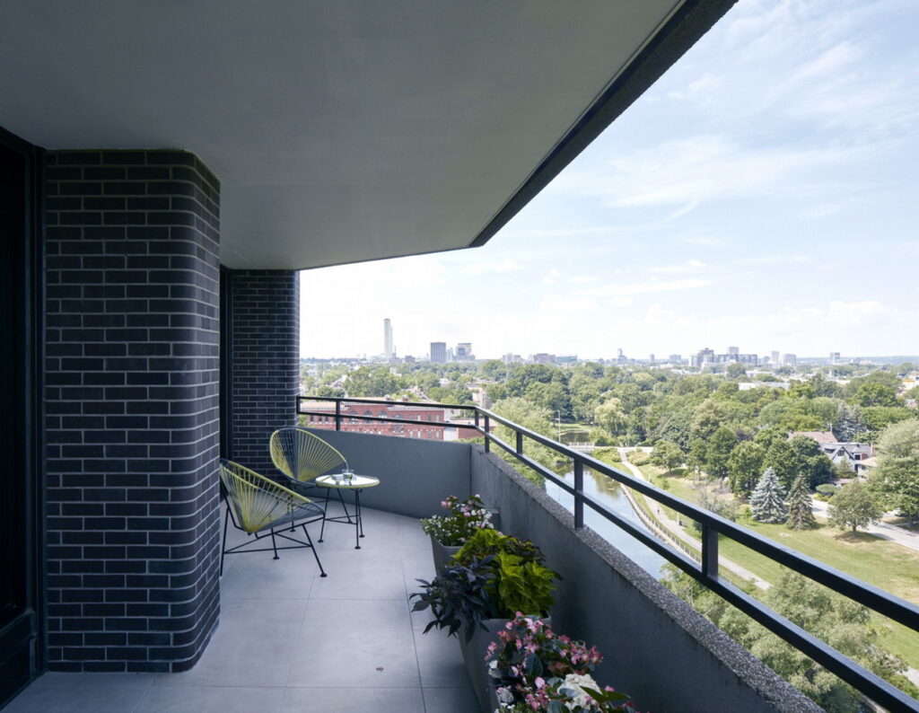
Turning the dated 1,560-square-foot apartment into a warm, welcoming and modern home started with knocking down walls to open up the enclosed kitchen.
“While the dining-living area was spacious, an open concept would make it even better,” says Brisset. “In new condos, the kitchen often stands out of proportion with the remnant space. Instead of a conspicuous kitchen, I wanted mine to blend with the living area.”
That meant designing the kitchen to look like furniture, with walnut cabinetry, no hardware on upper cabinets, integrated or concealed European-sized appliances, a retractable fan hood and an island that’s slightly higher than the perimeter wall counter, she says.
“The kitchen area was restricted between two walls that could not be touched. The biggest challenge there, and everywhere for that matter, was storage. Having been through multiple kitchen renovations before, I had planned what would go where and why, which allowed for precision in the choice of sizes and accessories for cabinets and drawers.”
That planning was greatly appreciated by the Simmonds team.
“She wasn’t saying, ‘I want it to look like this.’ She said, ‘I need to accommodate this and this,’ which is great for us,” says principal Christopher Simmonds. “She was very good at being able to give us that sort of information and the freedom to create something that was special.”
An unusual feature of the redesigned space was repurposing the breakfast nook beside the kitchen into a library that extends from the kitchen, using the same cabinetry to create a wall of millwork.
“It is her own sanctuary,” says Canolo. He designed the library based on a concept of asymmetrical blocks of solids and voids made famous by Dutch painter Piet Mondrian. The open spaces display art pieces and particular books, while the solid blocks hide items we don’t want to see, adds Simmonds.
“Because these spaces are right beside each other, it wouldn’t do to make them different finishes. You need to have this esthetic continuity.”
Brisset adds that from the living room, the display of art books and LED-lighted artefacts in the library shifts attention away from the kitchen. “Even the TV set is out of sight. With its Eames armchair, now complemented by two small armchairs (not shown in the photo below) to fit the angled windows, the library serves as a lounging area, where guests can enjoy a drink while conversing with the cook.”
At the other end of the kitchen is a clever design solution — a screen separating the front entrance and the kitchen. Mimicking the Mondrian concept of the library, it accomplishes multiple goals. It means you don’t see what’s on the kitchen counter, it delineates the front entrance, it offers another spot for displaying artworks, it provides more storage for things like mail and phone chargers, and it solves the problem of routing wiring to the island.
“That’s a nice feature,” says Canolo. “There’s a function and at the same time you’re creating a design.”
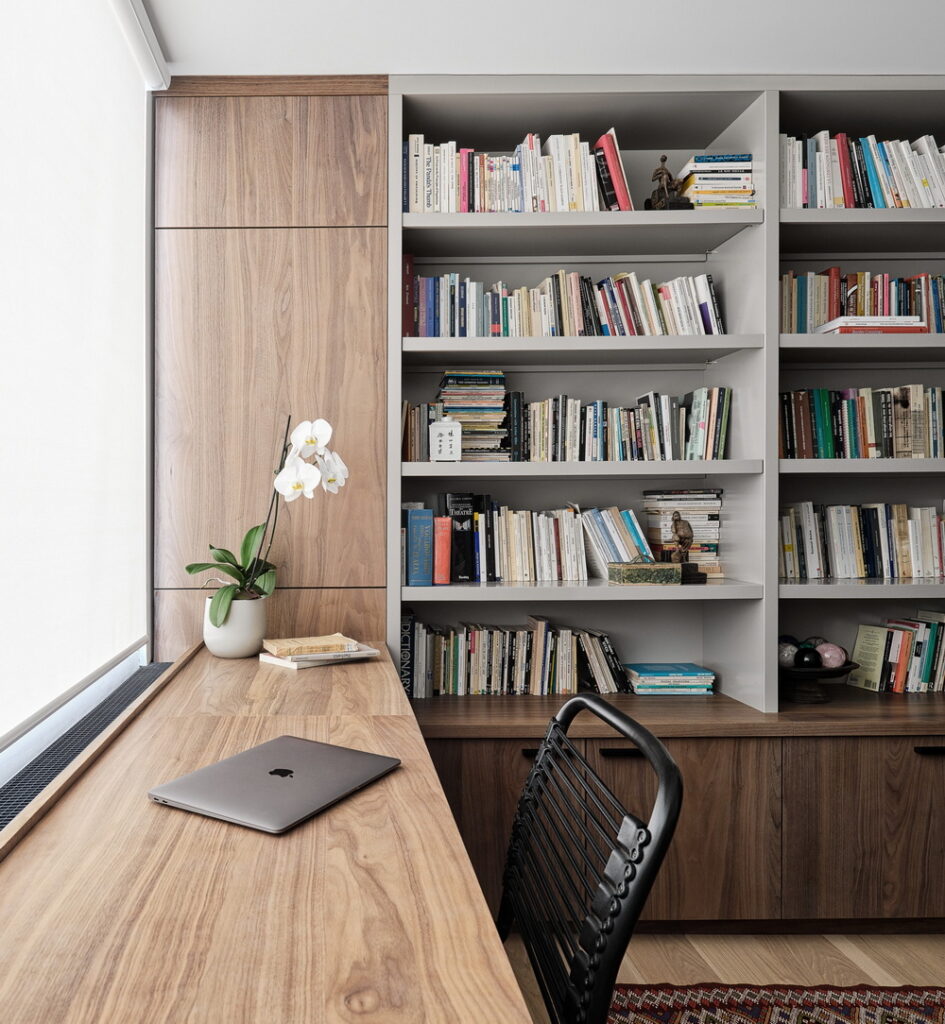
Another multipurpose element of the condo is the second bedroom, which stylishly does double duty as Brisset’s home office and becomes a guest room when needed.
“Every nook and cranny was made useful,” she says. A custom desk was placed along the window ledge — “facing Patterson Creek is a lovely and enticing view” — with three shallow drawers and two filing cabinets underneath — “a brilliant idea that leaves room for a queen-size sofa-bed.” Meanwhile, built-in shelving provides lots of room for the books she needs for her academic work and a panelled wall behind the sofa bed conceals a closet for guests.
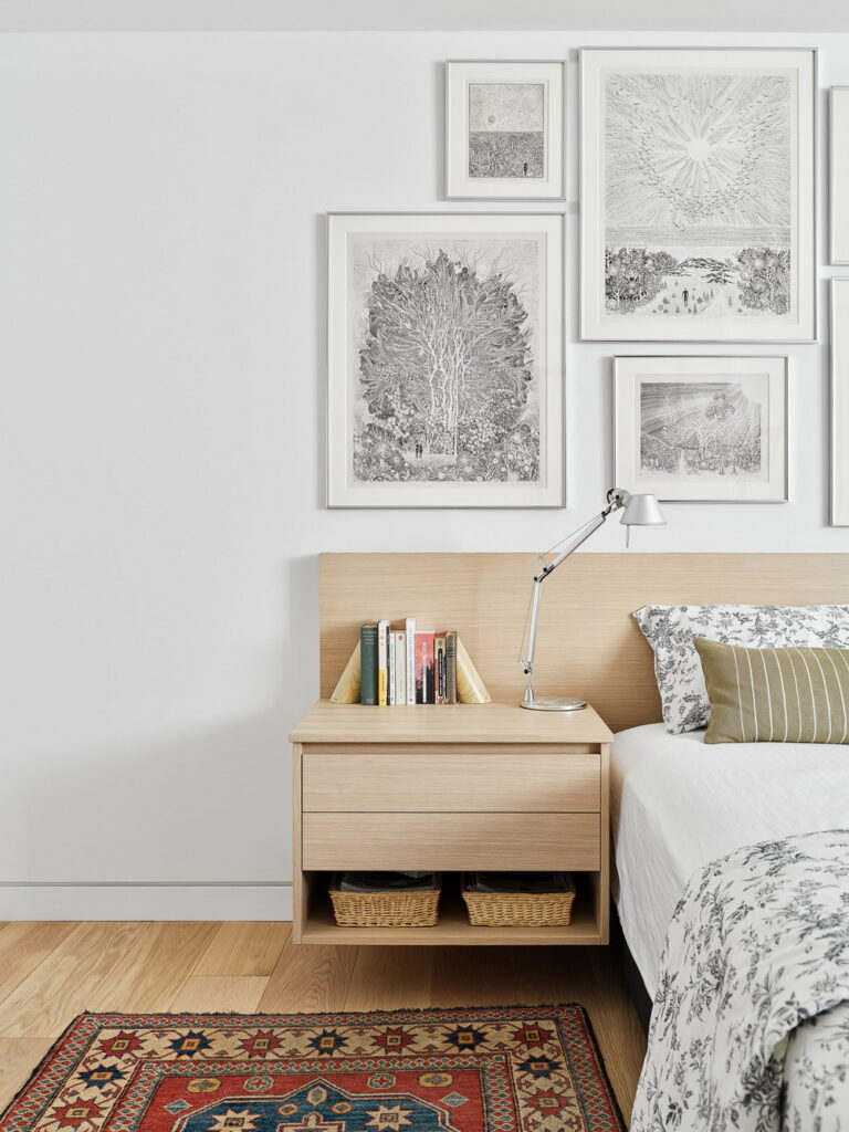
In the primary bedroom, Canolo created another elegant storage solution. With no walk-in closet, he instead wrapped closets around the walls, making room for a washer and dryer, ironing board and more. He then clad the cabinetry so they give the appearance of wall panelling and painted them white to lighten what had been a dark room.
He also created a custom floating headboard and night tables to ensure there would be enough room for a gallery of ink drawings by a friend. “A trough along the upper part of the headboard accommodates a line of mini-LED bulbs: it lights up the art pieces and provides a soft cosy light for reading,” Brisset says.
For both the Simmonds team and Crossford, the biggest challenge was executing the renovation during the pandemic. “That really stretched out the timeline,” says Simmonds, noting what should have taken about 18 months from initial meeting to completion instead took two years.
And for both, the best part of the project was their client. “She was just so nice the whole way through and so appreciative; that just made everything wonderful,” he says.
Brisset returns the compliment. “These were difficult times in my private life,” she reveals (her husband died before the renovation was completed). “Working with (the team) provided the confidence and relief I needed during that period.”
She goes on to say that while homeowners often complain about renovations being a painful experience, “I would start all over again on a new project with the same team.”
Condo renovation room by room
Kitchen
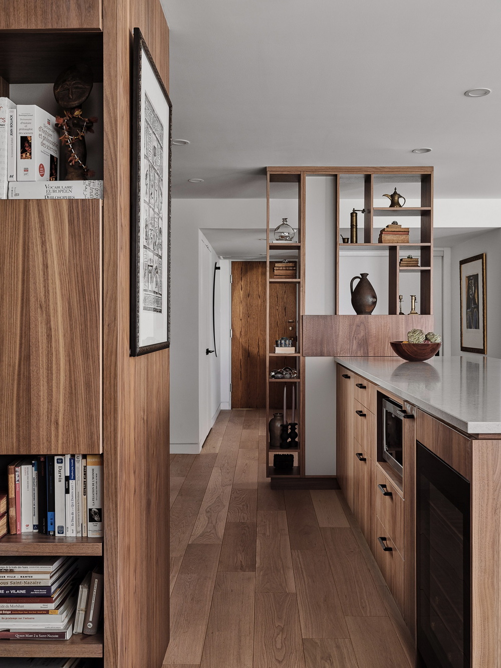
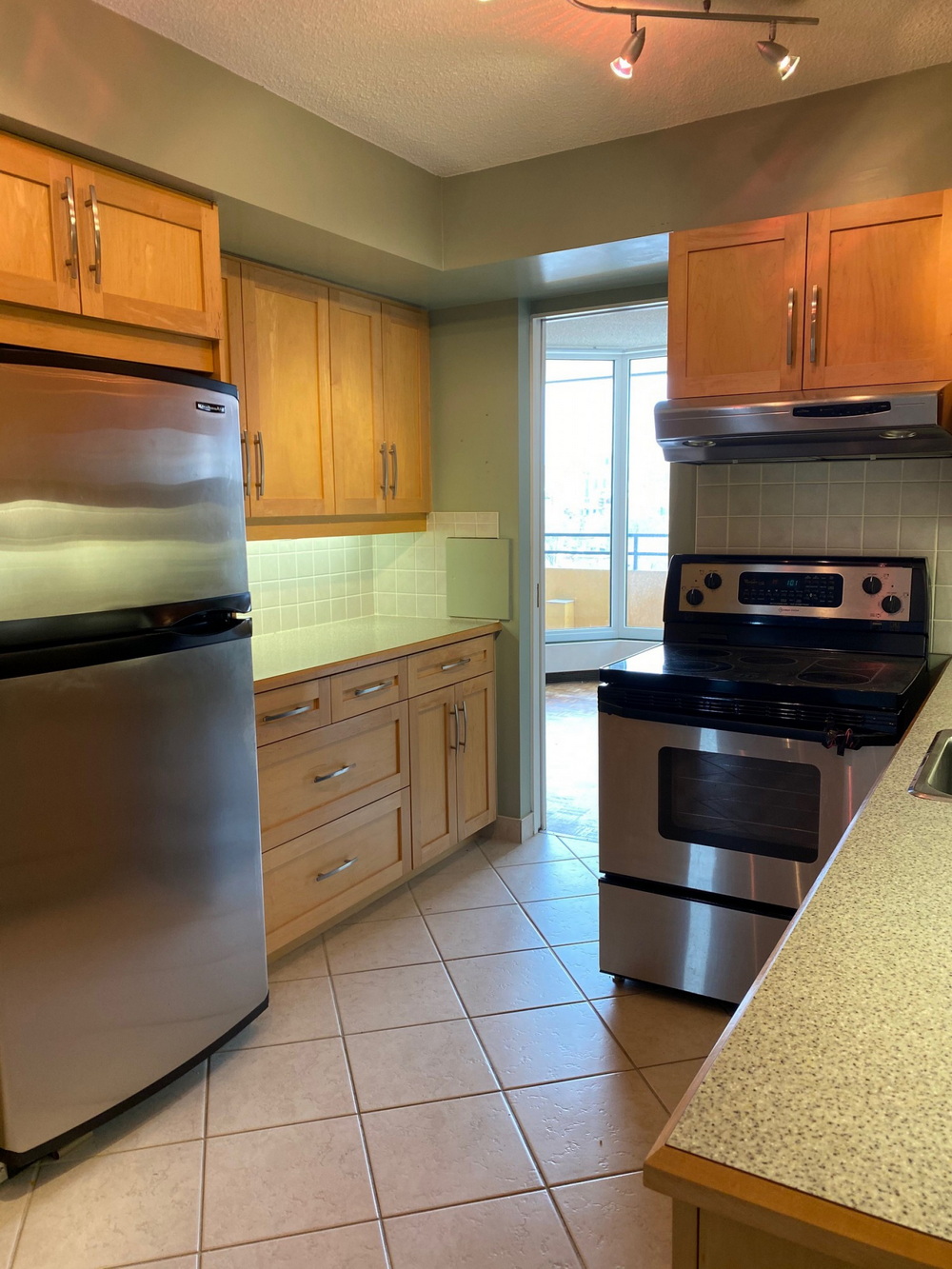
Having been through multiple kitchen renovations in the past, Brisset knew she didn’t want white and had particular ideas about what she needed the space to do. The formerly enclosed kitchen was opened and thoroughly redesigned.
Cedar Ridge Designs was able to take Canolo’s very detailed (and to-scale) drawings and figure out how to build the cabinetry.
Along with integrating the kitchen with the living room and dining room, having an overall lighting scheme for the whole apartment was key, says Simmonds. “Our strategy was to actually have some very thin furring strips and then a thin layer of drywall, just enough to run new wiring in the gap and new thin pot lights so we could bring that pot lighting through and then, where we wanted to, we could hang ceiling-mounted fixtures as well.”
Library
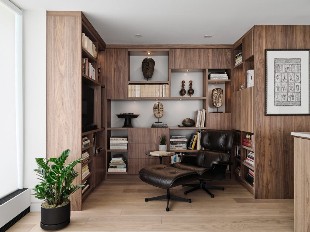
The library takes the place of what had been the breakfast nook, partly because that was really the only place for it, but also to make better use of the space. It’s a spot for Brisset to relax, read, watch TV, listen to music or, with the addition of two more chairs (not seen), it’s a spot for guests to relax while interacting with the cook.
“This opening up of what was the breakfast area allows more light to come into the kitchen and more view … you can look and have this wide panorama looking north over Patterson Creek,” says Simmonds.
Entry
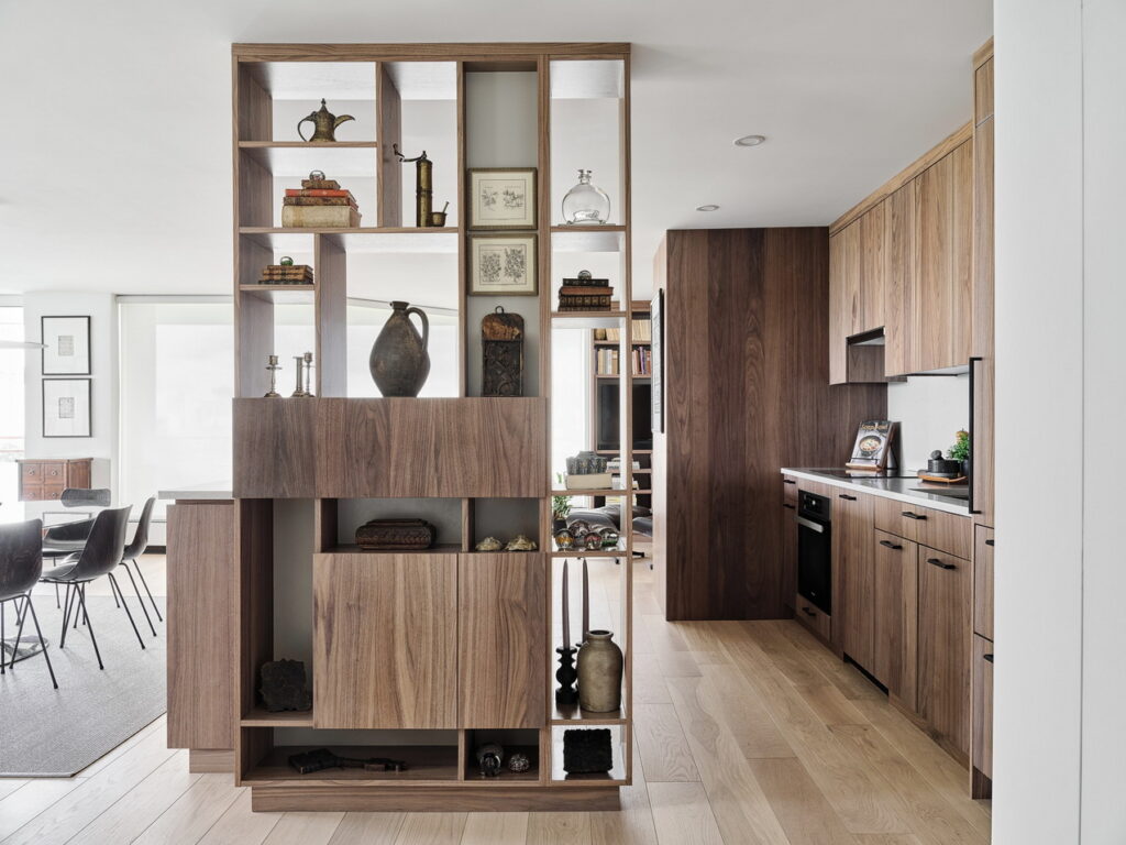
A screen divider is the first thing you see when entering the apartment, setting the tone and visually welcoming you in. It was an elegant solution to the problem of getting wiring to the kitchen island, but it also serves as a space for displaying art, a place to store everyday items such as mail and chargers and as a means of hiding any food prep happening on the island.
Living room
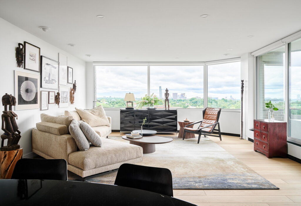
Apart from a few pieces, all furniture is new, Brisset says, brought from Italy and France where she spent a few months while waiting for the reno to be completed. The Molteni sofa was chosen “for its comfort and unique enveloping shape: it delineates the living space while guests face the stupendous panoramic view of the city at night.”
A gallery wall accommodates art pieces that share the black, off-white and grey tones of the room. “They are mixed with Senufo masks echoing a sculpture from Tanzania and a ceremonial staff I managed to haul from Victoria Falls (in Africa) when air security checks were not yet prohibitive.”
A separate electrical circuit provides dimmable lighting above the art pieces and artefacts only, “making the kitchen area vanish in the dark and look more like furniture,” she notes.
Dining room
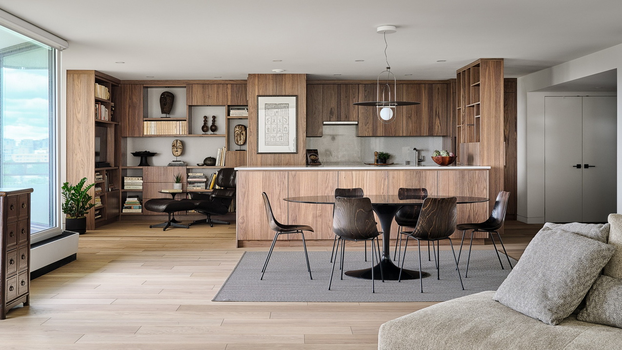
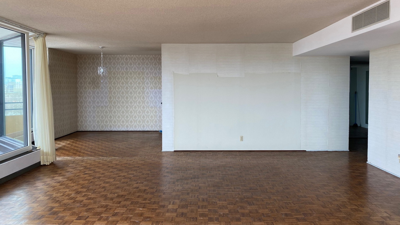
The part of the island facing the dining area acts as a sideboard, says Brisset. Inside the cabinets are rolling drawers and shelves housing a bar, dishes and cutlery. “The dining table by Knoll was selected for its oval, unobtrusive shape that easily accommodates eight people. Dark brown resin chairs by Pierre Paulin are super comfortable while taking up little space.”
Primary suite
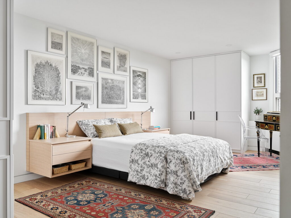
The floating headboard and night tables were done in white oak to keep things light. The headboard is also low profile to leave plenty of room for a gallery of ink drawings by a friend of Brisset’s.
Simmonds points out that not only did Canolo help Brisset figure out how to display the gallery, he went over on a day off to help her hang them. He jokes that Canolo became an adopted son to Brisset by the end of the project.
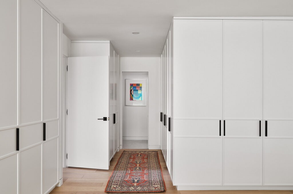
Closets wrap around the room, more than making up for the lack of a walk-in. “Aside from various technical solutions such as ducts cleverly rerouted to improve ceiling height (low ceilings were the norm in the 1970s), increased and efficient storage space throughout the apartment is the most important design achievement, a tremendous improvement over the original layout (that) I appreciate every day,” says Brisset.
The slightly raised profile of the doors creates the effect of wall panelling to add texture without being overpowering.
The closets are “fitted with accessories such as cubicles and lots of sliding drawers to accommodate not only clothes, jewels, bags or shoes but also washer and dryer, ironing board, etc.,” she says. “Everything is neatly tucked away behind elegant doors … only then do you realize how much space was originally wasted.”
Meanwhile, the entry to the ensuite at the rear was reorganized so that all that is seen on approach is a wall displaying art.
Office / guest room
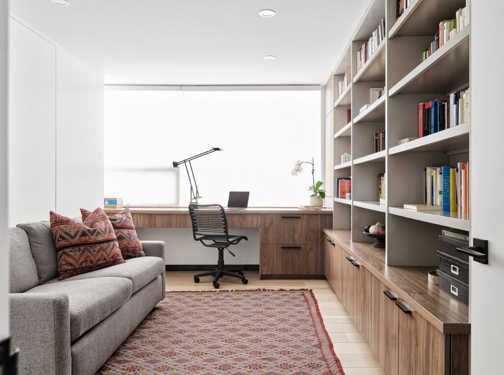
With only two bedrooms and the need for a home office, it was important for the second bedroom to be multifunctional. “We didn’t want to design for an office with a big desk in the middle of the space, so we had a desk as a ledge over the window,” says Canolo. “When working, she has a view of that and that becomes like a side table to the sofa bed.”
Combined with the queen-sized sofa bed and concealed guest closet, “the whole thing does not look like it is a bedroom, but we were able to put those two functions together,” he says.
