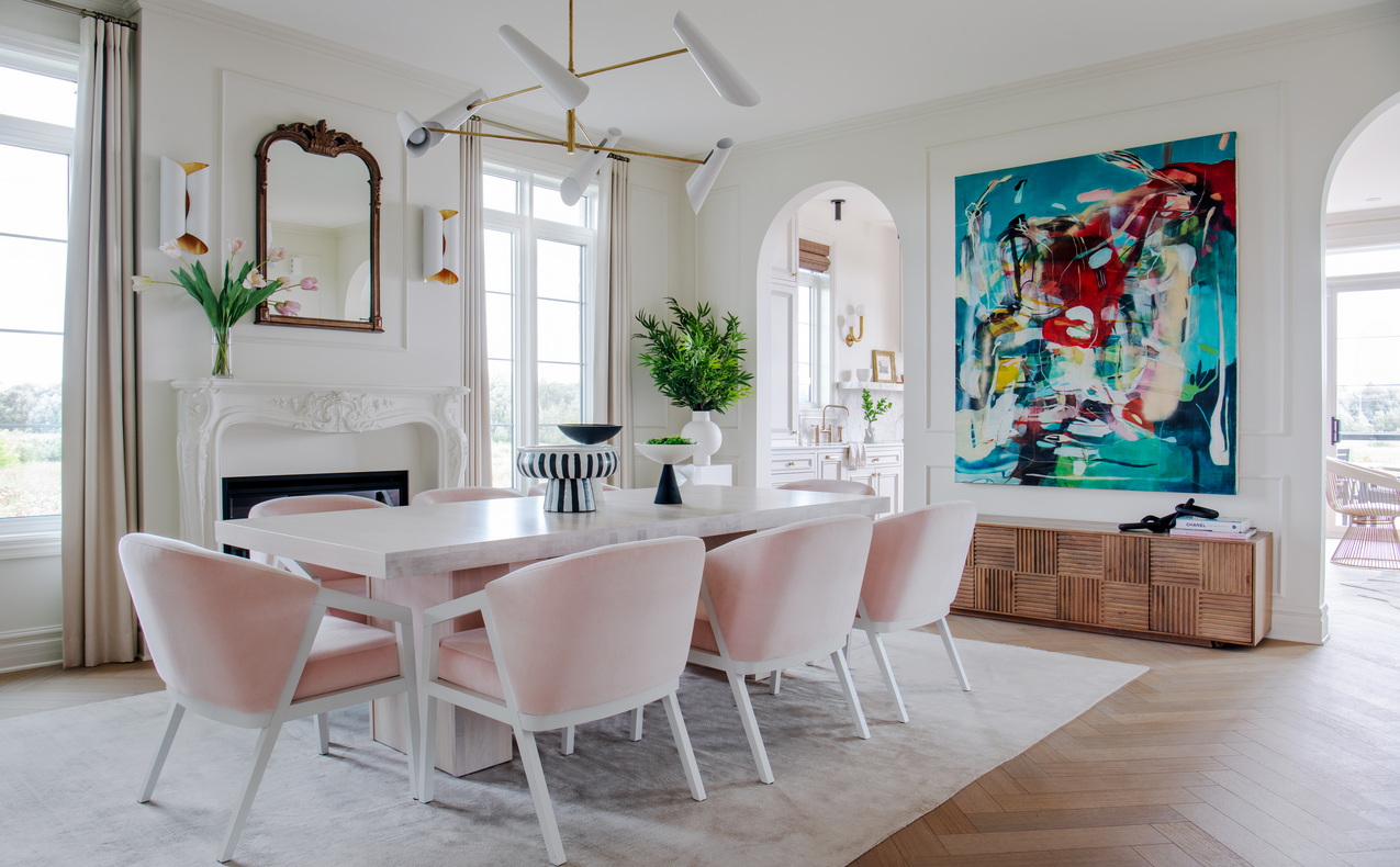
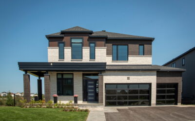
Paris has come to Kanata in the form of the 2022 Minto Dream Home.
The home makes up the bulk of the $3.4-million grand prize in the annual CHEO Dream of a Lifetime lottery, which launched Sept. 7, and designer Tanya Collins took inspiration from the quintessential Parisian apartment when designing this year’s home.
“This all came from watching the Emily in Paris series with my teenage daughter,” Collins admitted at the lottery launch. “I fell in love with Paris all over again.”
Jump right to:
Floor plan
Room by room
Touring & tickets
Although the exterior is a modern prairie style to better fit with the streetscape, the interior is modeled after the Haussmann style that dominated central Paris architecture in the late 1800s and still defines the city today.
“Typically, you have the big, bright, open rooms, tall windows, applied wall mouldings, herringbone floors, iron railings,” she says. “The flavour is there for sure.”
But as she is known to do, Collins puts her own spin on things, blending styles and new and old for a look that’s fresh and inviting. This is the fifth dream home for which Collins has done the interior design, with each one having a different personality. Last year’s home, for instance, was a mid-century modern and southwestern mashup.
Where this year’s version tilts a bit feminine, next year’s home, which she started planning even before this year’s was finished, will be more masculine, she says.

This year’s home is called Le Rêve, which — appropriately — means dream. It’s based on Minto Communities’ Quinton with Guest Suite model, designed by product development manager Karen van der Velden and introduced in 2020.
“It’s a multigenerational home, inspired by the pandemic to ensure you could have a main-floor guest suite with three-piece bathroom so that you could have your loved ones connected on the main floor,” van der Velden says.
It’s typically a six-bedroom home (five upstairs and the main-floor suite) with an optional seventh bedroom in the basement and comes with 3,400 square feet (not including the basement) and 4.5 bathrooms.
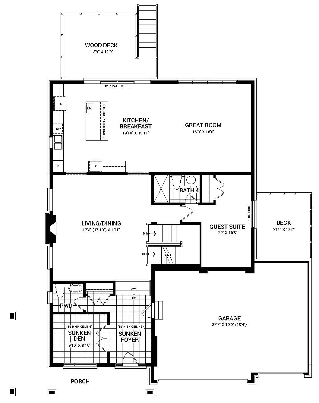
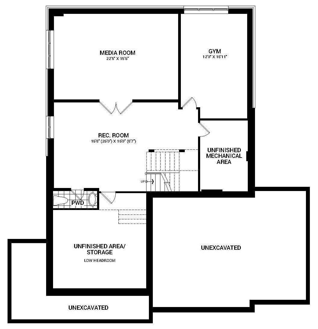
Surprisingly little of the original floor plan has been altered to turn it into a dream home. On the main floor, the formal living room and dining room have been combined into a grand dining room with a neoclassical fireplace, openings from the dining room to the kitchen and family room have been turned into archways, there was room on the extra-wide lot for both a balcony off the guest suite and a wraparound porch, and a third garage was added.
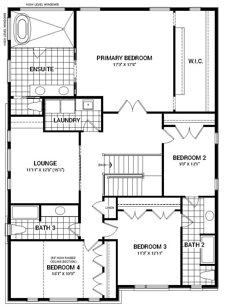
Upstairs, the bedroom at the top of the stairs became a lounge with mullioned glass doors, the primary suite was adjusted to turn the walk-in closet into a walk-through closet behind the bed (stealing some square footage from the nursery next door) and a glass wall encloses a standalone tub and shower wet zone. With the finished basement, the home is 4,658 square feet.
“I could live here, it’s a great space,” Collins says.
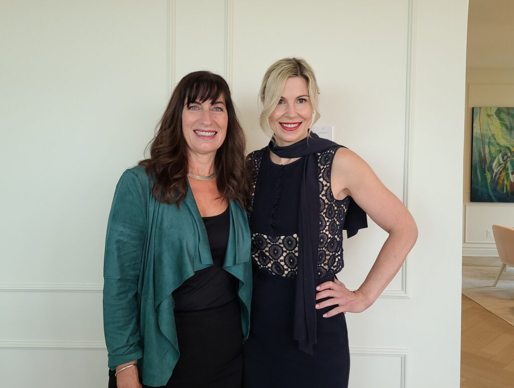
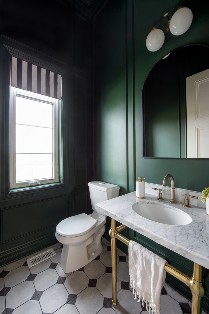
While the floor plan may be easily replicated, the interior design is definitely unique. Tones are muted for the most part, with soft blushes, mustards and blues interspersed with bursts of boldness, like the powder room where the deep green wall colour is carried through the ceiling, which is covered in a textured wallpaper that looks like painted tin.
“I’ve kind of hit on lots of different colours, but it’s in small doses. It’s not going to be completely without any colour but it’s definitely neutral overall,” Collins says.
In another example of the unexpected, she gave each floor a different interior door colour — black in the basement, white on the main floor (“so when you first come in it feels very light and airy”) and chalky blue upstairs.
“I wouldn’t typically do that, but with the CHEO homes people are always looking for things that are a little bit different, so I’m just trying to mix it up a little bit,” she says.
The home is also showcasing several energy-efficiency features, including an innovative Panasonic technology system for improved indoor air quality, rooftop solar panels with battery storage, beefed up insulation and a greywater system to reduce water consumption by repurposing shower water for the toilets, says van der Velden.
And for the first time, the home has been built in a Minto community in Kanata, in well-established Arcadia. It sits on an oversized lot that backs onto a stormwater pond and the Carp River Conservation Area, offering uninterrupted natural views. It’s also close to Kanata Centrum and Signature Centre shopping plazas, as well as Tanger Outlets, the Canadian Tire Centre, and the popular South March Highlands Conservation Forest.
2022 Minto Dream Home – room by room
The kitchen
The kitchen is always one of Collins’ favourite parts of the dream home because she puts so much energy into it.
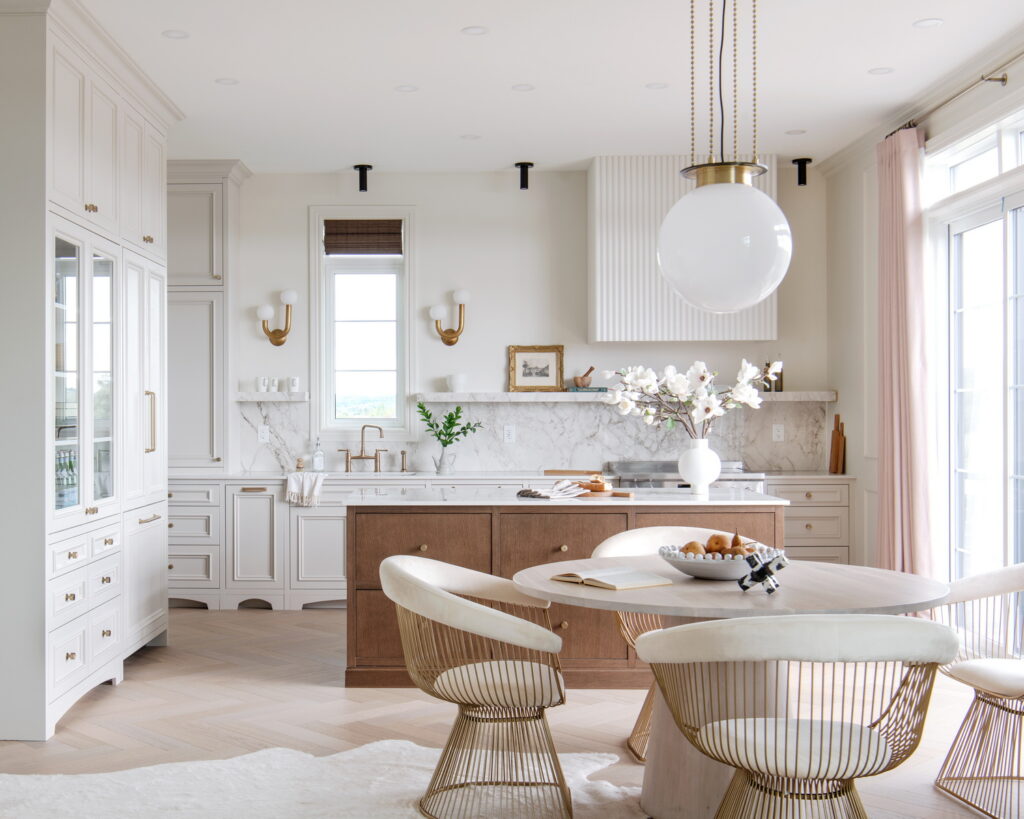
This year she’s “quite excited about it. I love the kitchen, just the detailing. The millwork, the cabinet door style, I love the fluted hood, I like the floating shelf. It’s just got all the elements.”
The millwork this year is by Irpinia Kitchens and she opted for cabinetry that has moulding applied to the door, “which is very much a Parisian feature.”
She did adjust the floor plan a bit in the kitchen, moving the sink off the island and under the window and omitting a second window on the sink wall to offset the stove and range hood.
She also decided against island pendant lighting (using pot lights instead) so as not to pull focus away from the back wall and “just to try and show that you can do different things.”
And having a partial backsplash that ends in a chunky floating shelf accomplishes a few things: It’s a way to have a luxury feel with the marble-look Dekton stone; it gives you a nice play of texture between the wall and stone; it also becomes a functional element that you can display items on; and it meets the desire to have the kitchen look less like a kitchen, she says.
The dining room
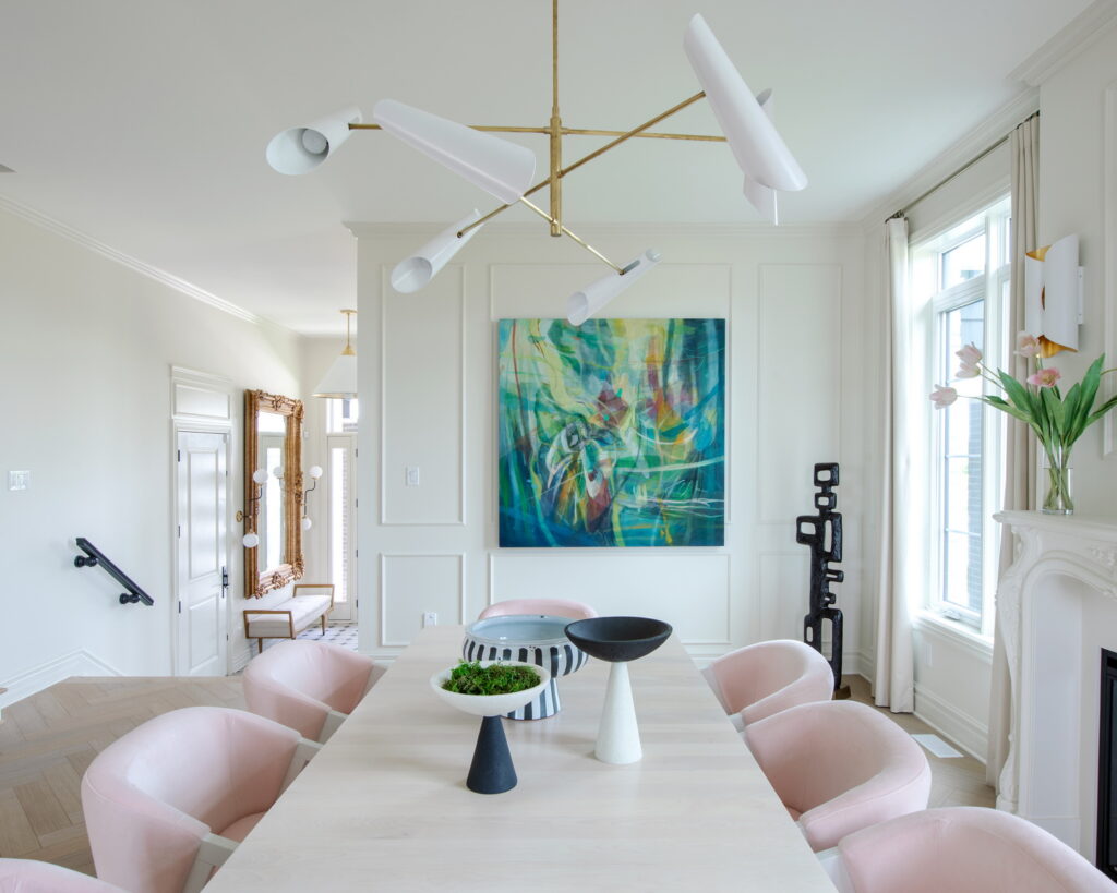
The original plan called for this space to be a combined living room and dining room, but Collins chose to make it one large dining space because it made the most sense for her vision, and with so many flow-through points — from the stairs, the main-floor bedroom, the kitchen, the foyer — it was also the best solution. And it shows what you can do different in the space.
The dining room is the first big space where we see the broader influence of the Parisian style that’s touched on in the front entry area. The ornateness of the wall mouldings, the traditional fireplace (which was in the great room on the original plan) and the Louis-style mirror speaks to the Parisian style, “but then I’ve got this light fixture that’s very modern to juxtapose,” she says. “It’s very chic. This is not French country.”
When asked what about this home will appeal to those with a more modern sensibility, she points to the high ceilings and the sense of light in the home.
“Are they going to love the archways or these panelled walls? Maybe not, but I think what will draw them in is some of the modern touches of furniture … You’re picking and choosing the shape of the furniture, the classic with the contemporary and how they go together … I think it’s a way to bridge people’s different interests.”
The living room
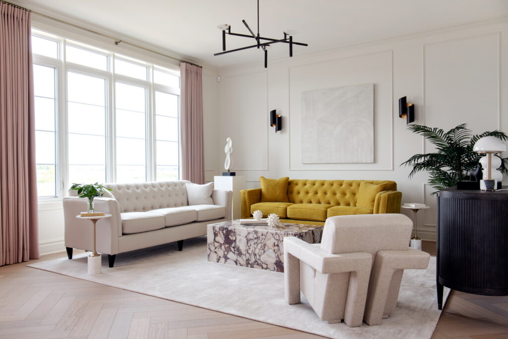
This room has been designed to make it feel like it could be a formal living room as well as a family room and is done so that everything is not all centred around the TV.
The decor palette mixes injections of colour on a neutral backdrop. “I’ve got a mustard sofa going in the living room with a blush pink, so I’m kind of tweaking the colour palette a little bit,” says Collins, who was inspired to mix mustard and pink by a Christmas flower bouquet she received last year.
Along with the kitchen beside it, this space benefits from an infusion of natural light and a beautiful view of the pond and natural area beyond.
The foyer
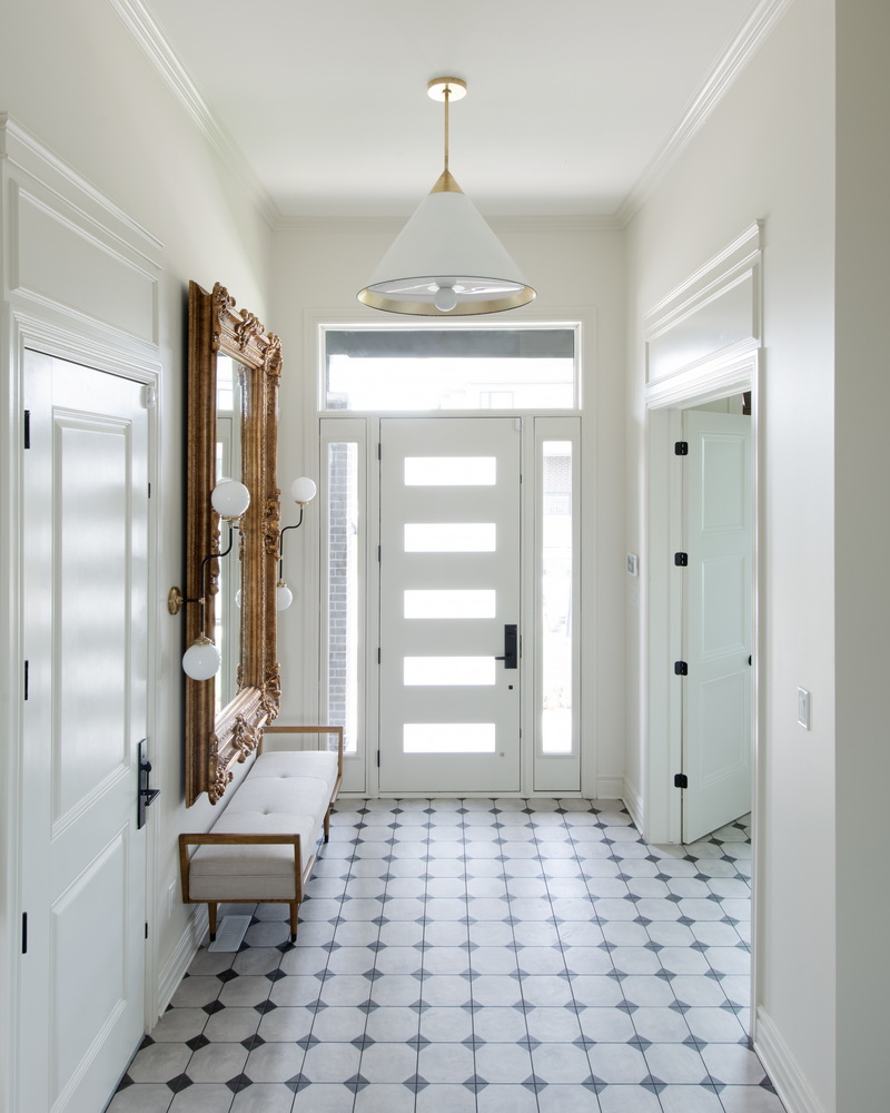
Most of the main floor has 10-foot ceilings, but in the sunken foyer, den and powder room, the ceiling stretches closer to 13 feet.
Collins chose to run tile through the whole area to keep it clean and neat. “It’s the quintessential French, little bit of a diamond pattern tile … it’s a timeless, classic tile choice.”
Another cue to the home’s style: The enormous ornate gilded mirror.
The den
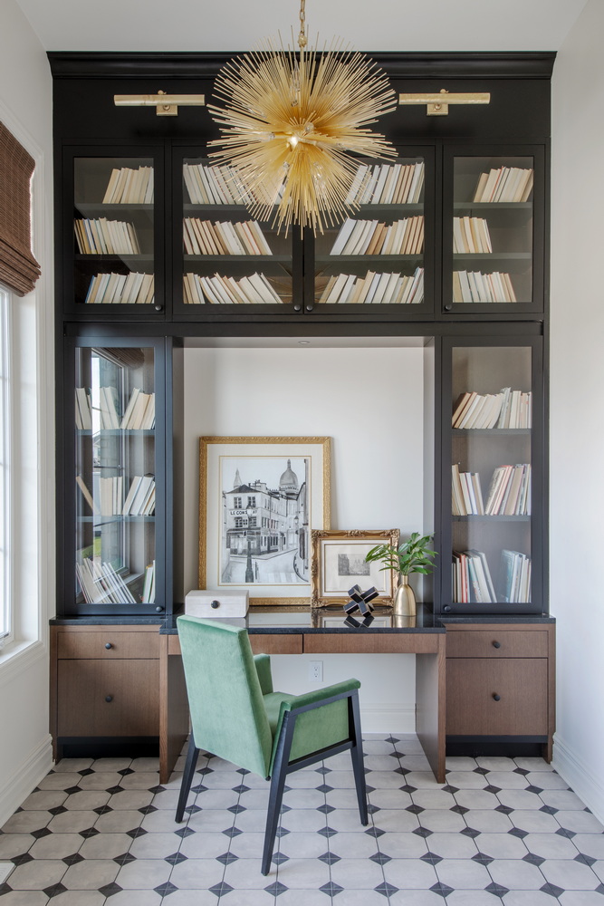
Just off the foyer is a compact but useful den. Shelving extends to the ceiling and will be accessed by a library ladder that was yet to arrive to maximize the vertical space. And a showy light fixture — a Collins signature — visually lowers the ceiling.
The powder room
Feeling very Parisian, the moody powder room is covered in dark green, both on the walls and the ceiling, which features a damask patterned wallpaper that gives the appearance of painted tin.
The main-floor guest suite
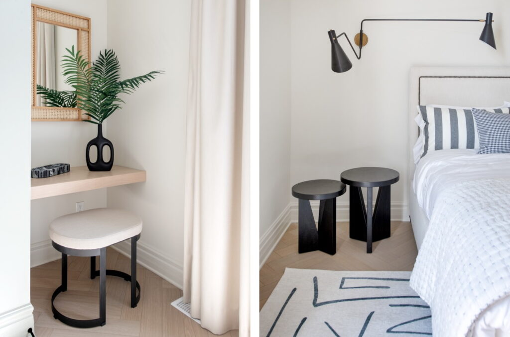
Although not large, this suite has been styled to show that it can be a two-person bedroom, even if it often would be used for just one. It includes a vanity area, a three-piece bathroom with walk-in shower (not shown) and a private south-facing balcony perfect for relaxing with a good book.
The primary suite
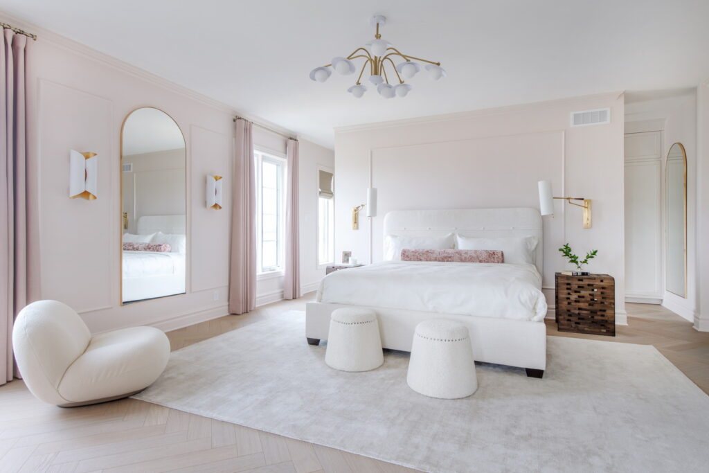
“It’s very soothing and restful,” Collins says. The walls are subtly pink — part of the slightly feminine feel to the home this year — and the furniture is very curated, she says.
Along with the kitchen, the primary suite is among her favourite spaces this year. Behind the bed is the walk-through closet, with floor-to-ceiling cabinetry and its own window. Stretching across the back of the home, this space overlooks the pond and the Carp River beyond.
The primary ensuite
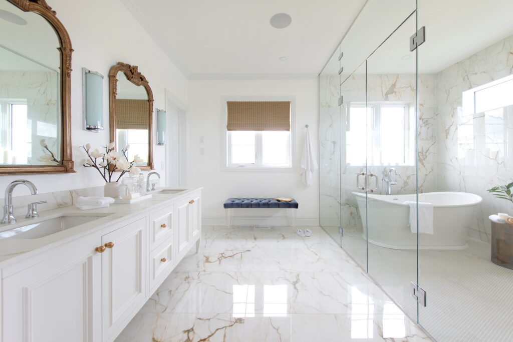
The pampering continues in the ensuite. “People are going to be talking about it,” van der Velden says, particularly the combined walk-in shower and tub wet room with marble-look slab tile on the walls. “Tanya and I have been wanting to include (a wet room) but there was never the right floor plan” before now, she says. “It’s always interesting to see what we can do to the ensuite.”
Opposite the tub and shower is a traditional vanity with ornate mirrors and separate water closet. “It’s a true spa experience,” says van der Velden. “What a great space to wake up in.”
The nursery
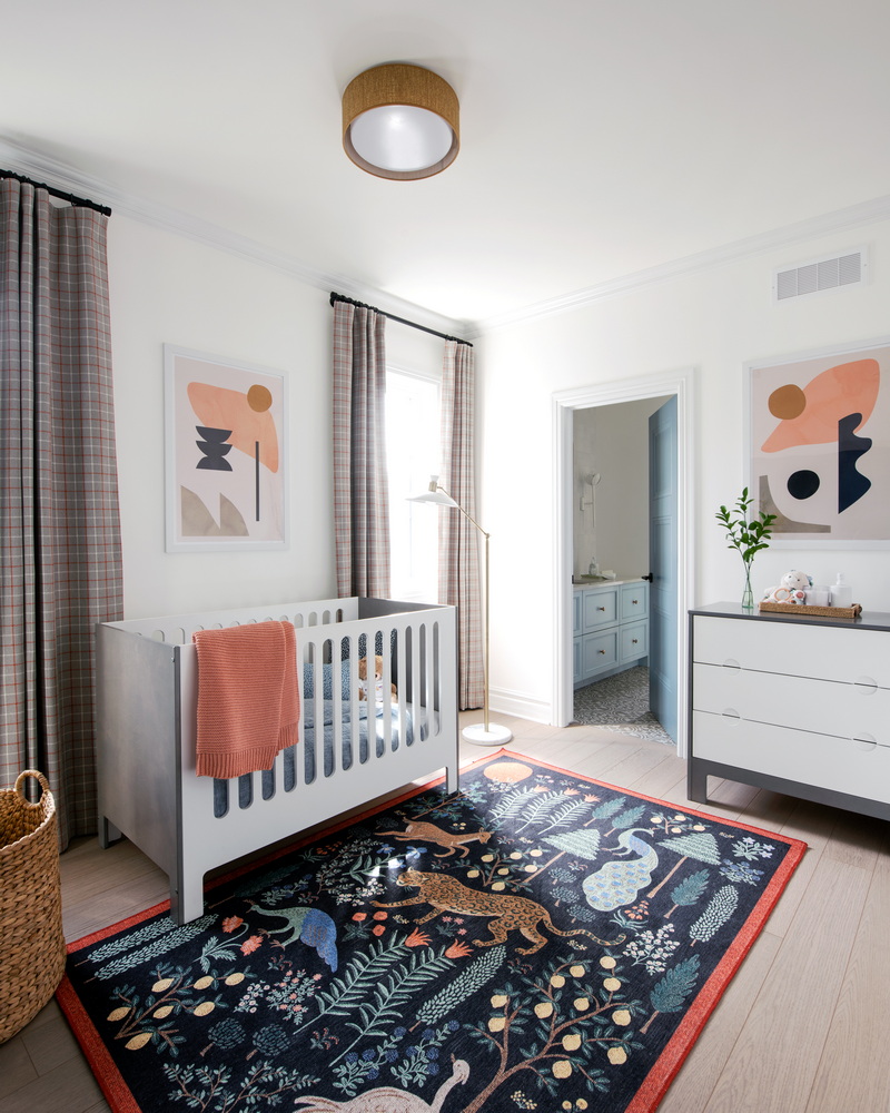
Not a usual feature in a dream home, a nursery was added this year because this room lent itself to this kind of use, Collins says, who sourced the furniture herself (the rest of the home is furnished by La-Z-Boy).
Of the secondary bedrooms, Collins noted that “these are definitely a lot more kid-friendly rooms, so there’s a lot more colour.”
The nursery shares a Jack-and-Jill bathroom with the bedroom next door.
The main bathroom
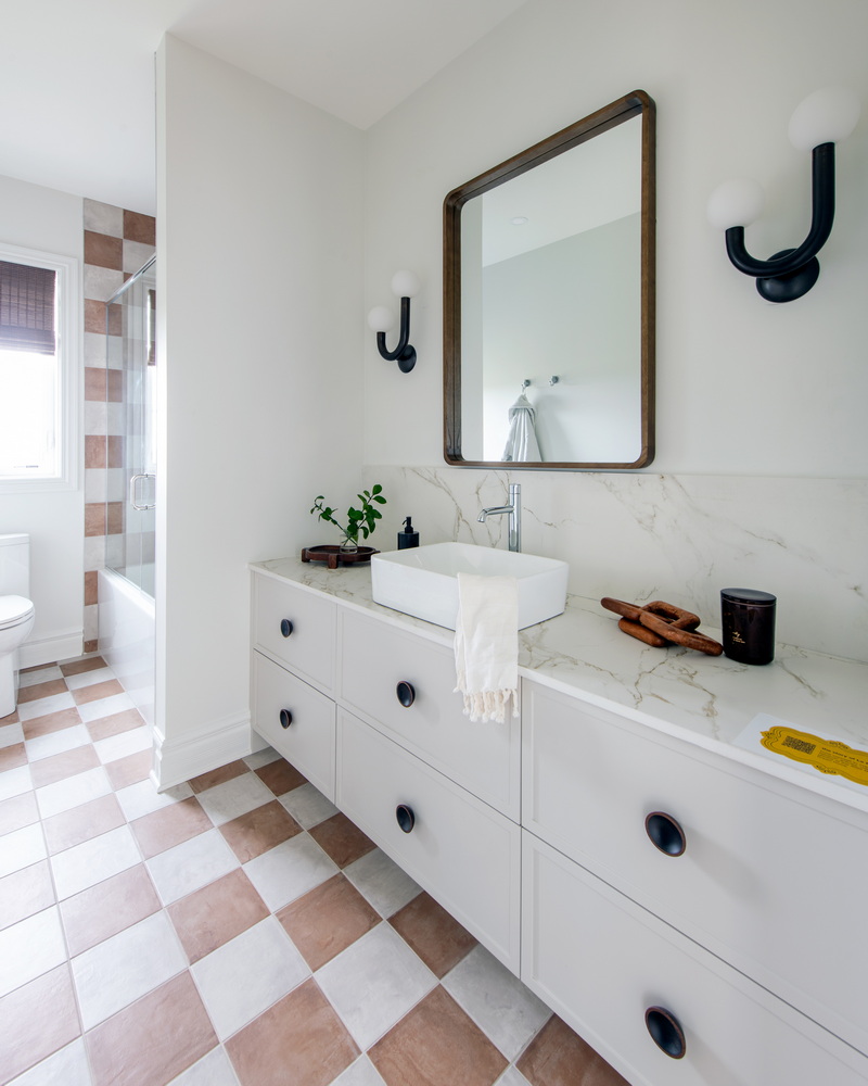
“In this house there’s kind of Emily in Paris references, a little bit of pop culture with the plaid,” says Collins, referring to the popular Netflix series. An example is the checkerboard tile in the main bathroom, which is carried through to the shower wall tile. To visually warm up the space, the tile is done in a warmer, aged-looking earth tone rather than the more typical black and white.
The guest room
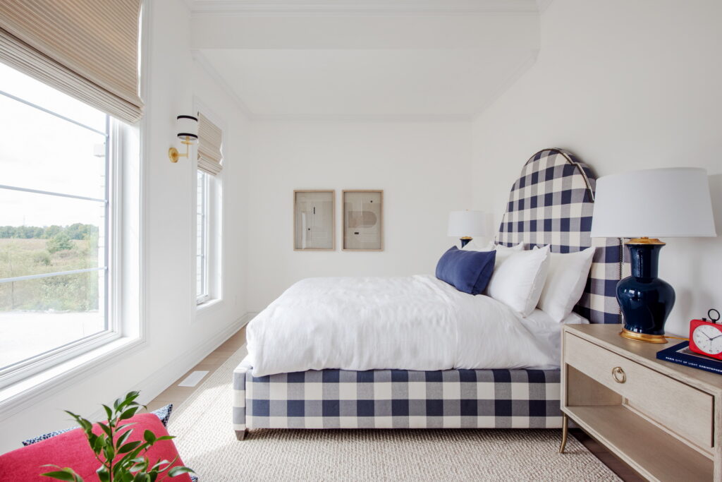
The Emily in Paris references continue in the guest room with the checkerboard headboard and pops of red.
The lounge
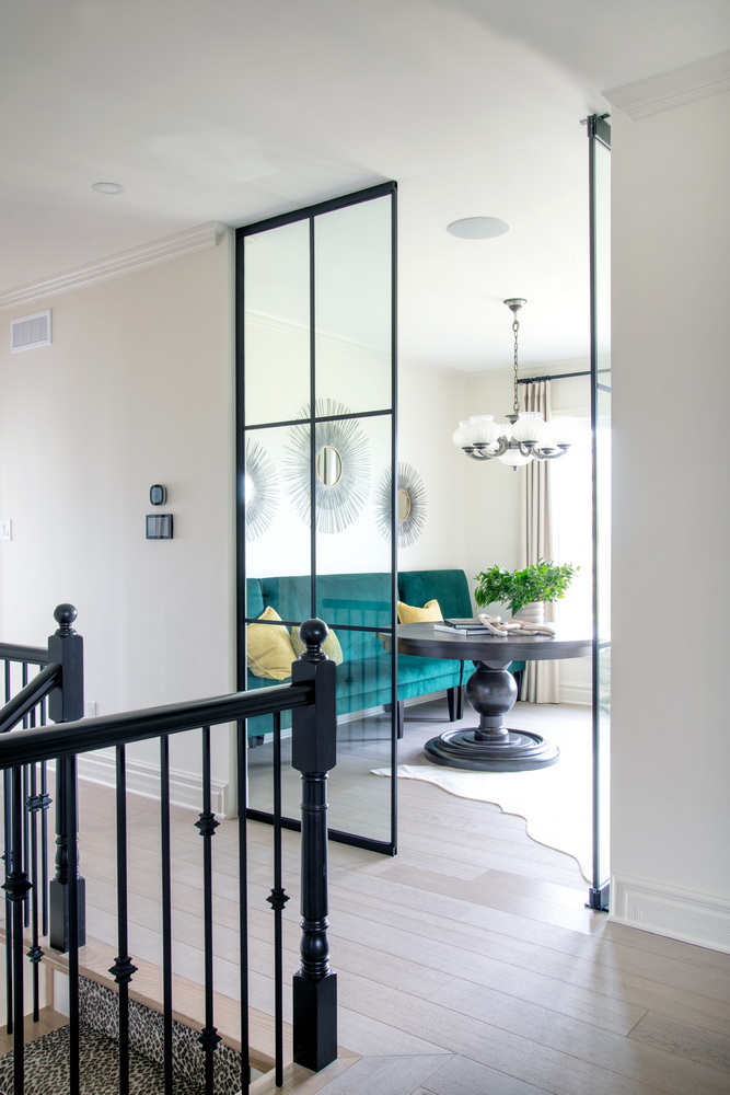
One of the home’s wow features is the second-floor lounge at the top of the stairs. Originally a fifth bedroom, the idea was to show how the space could be used differently, create impact and make use of the view through large windows that also serve to flood the hallway and stairwell with natural light.
Framed in with a black grill mullioned glass wall and door that are “more spectacular than I dreamed of,” van der Velden says, the room is a flex space that could be an office, family room or kids’ hangout.
It’s also van der Velden’s favourite part of the home. “It’s a fabulous space to hang out in, especially with the large windows overlooking green space, plus will capture the evening sunsets.”
The laundry room
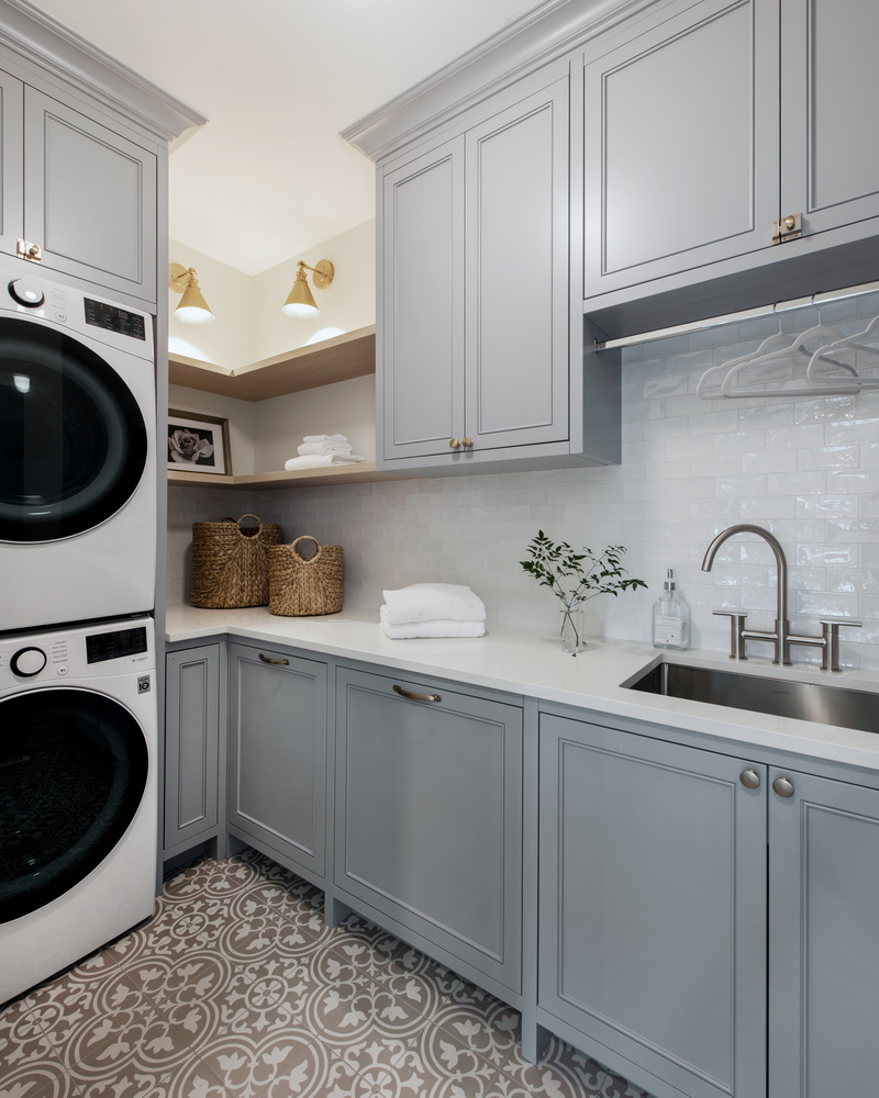
The well-appointed and handy second-floor laundry room helps separate the primary suite from the lounge. The full-size washer and dryer are stacked so as not to take up valuable floor space and the Parisian theme continues even here, with damask-type tiles and the French blue of the cabinetry.
“It has everything you need,” Collins says.
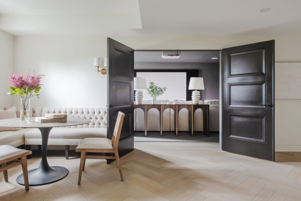
The rec room
The main space in the basement is the open rec room at the bottom of the stairs. Big enough for playing, the banquette seating and games table could easily become another work space. And the herringbone flooring found throughout the house is carried through the basement, too.
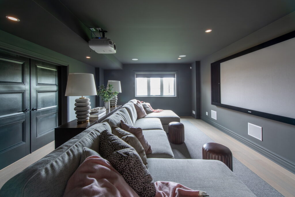
The media room
Another big part of the basement is the large media room. Boasting dark charcoal walls, ideal for watching movies, it also includes a large window so you don’t feel like you’re in the basement.
“It’s a good place to hang out and watch a movie,” Collins says.
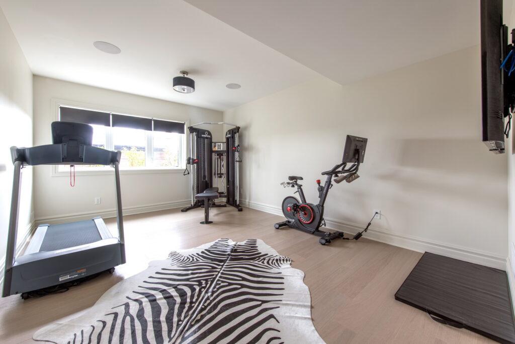
The gym
As a lookout basement, there is room for large windows for lots of natural light and so you don’t feel like you’re below grade.
“It feels like a walkout basement,” Collins says.
The well-appointed gym looks out to the backyard and comes equipped with a TV (not shown) along with the equipment.
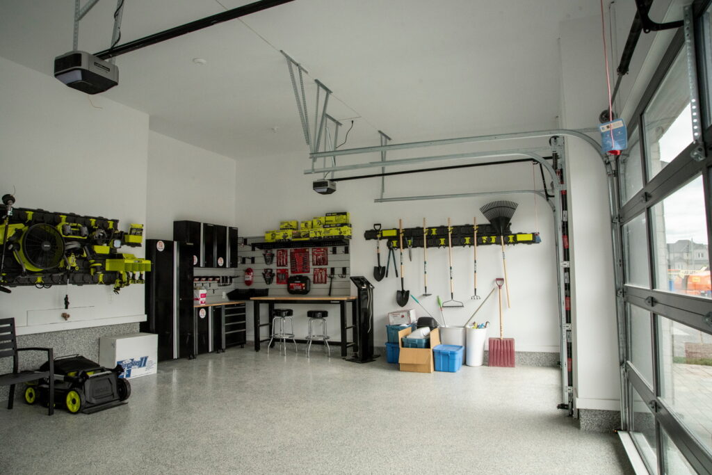
The garage
The original floor plan includes a double-car garage but because of the lot, Minto was able to add a third. Featuring tinted glass doors and fully outfitted, this is one garage you’d want to spend time in.
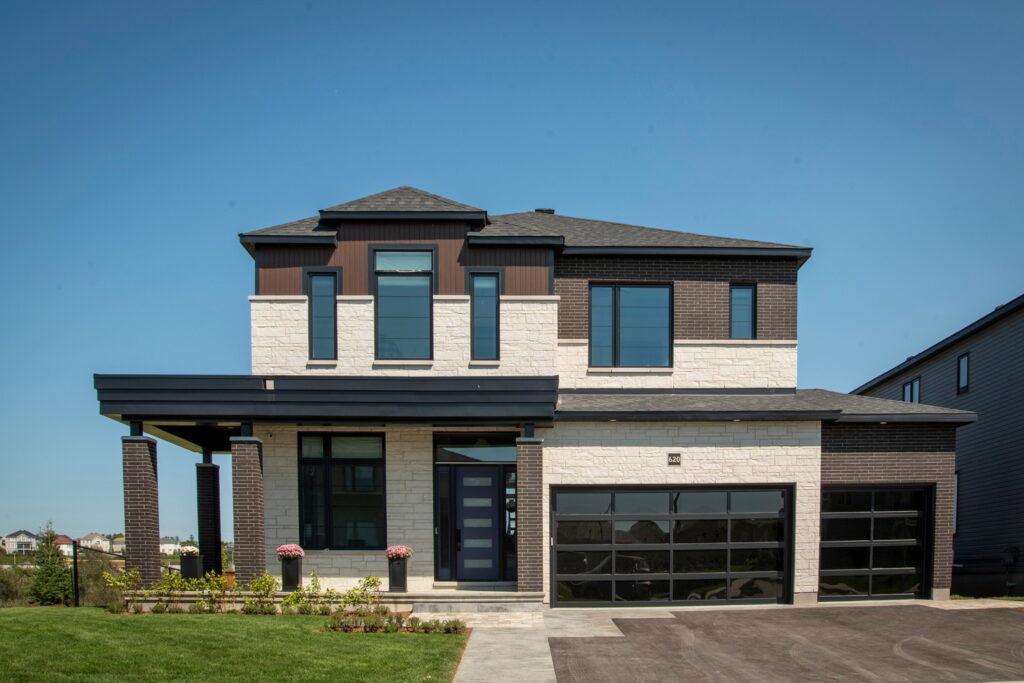
The front yard
Located beside a generous pathway and with no rear neighbours, “this lot is fabulous,” says van der Velden.
The exterior is a modern prairie style with wraparound porch to maximize views and create a connection to green space, she says.
The home features a mix of stone, brick, vinyl and wood-look metal and the elevation has already been incorporated into Minto’s portfolio, something that usually takes a year or so to do after being introduced in a dream home.
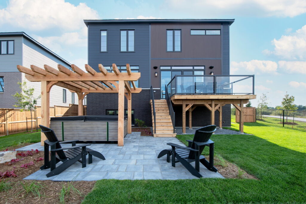
The backyard
An oversized corner-like lot, the backyard includes a large raised deck off the kitchen with glass railing so as not to impede the view and is landscaped with a lounging patio and pergola-covered hot tub from Mermaid Pools & Hot Tubs. Although not visible, there are solar panels on the roof.
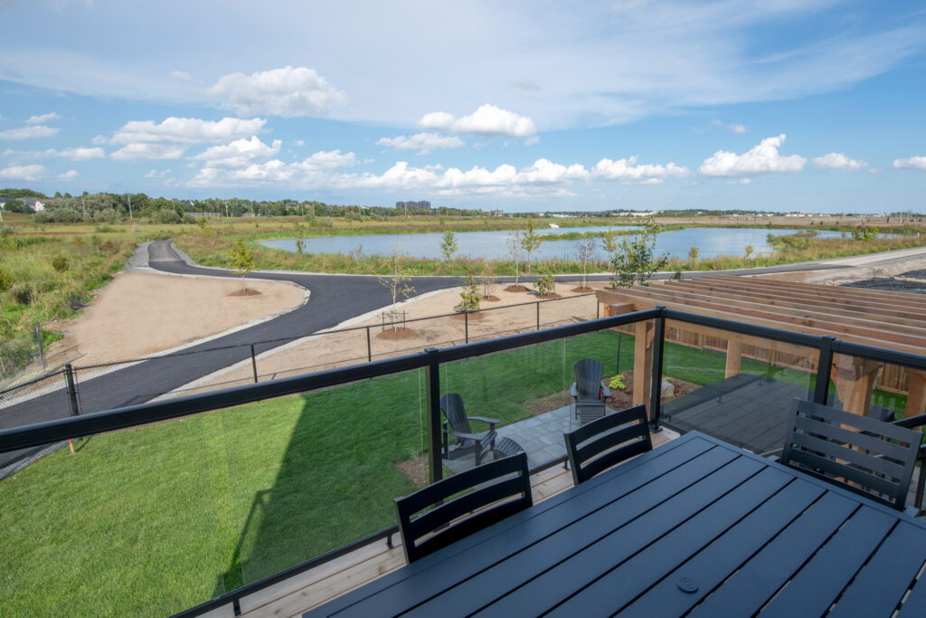
The view
Backing onto the stormwater pond and the Carp River floodplain beyond, the expanse of natural space is impressive.
“It’s really nice for an urban setting to be able to go in the backyard and look out at that rather than another home,” says Steve Read, the CHEO Foundation’s acting CEO. “You’re not far from everything and yet it does feel a little bit removed … Somebody’s going to be happy with all this.”
Visiting the 2022 Minto Dream Home
Where: 620 Winterset Rd., Kanata
When: Monday to Friday, noon to 8 p.m.; weekends and Thanksgiving Monday, 10 a.m. to 6 p.m.
Virtual tour: Expected on the lottery website by the end of September [Editor’s note Sept. 22, 2022: The virtual tour is now available]
Tickets: $100 each or 3 for $250; 50/50 tickets, which can be purchased if you have a lottery ticket, are $10 each, five for $25 or 15 for $50. There are also packages that combine lottery and 50/50 tickets.
Where to buy: dreamofalifetime.ca or by phone at 613-722-5437 or 1-877-562-5437. You can also purchase at the dream home, but no cash or cheques taken.
Deadlines: Early bird deadlines for various prizes are Sept. 23, Oct. 28 and Nov. 18. Final deadline is Dec. 16.
